


Who Becomes Data Artists?
Personal Data, Data Art Interviews and the Beauty of Emotions

Hello everyone!
And now, back to data art! Data art creators can be divided into four expressive groups, with overlaps being rare but still occurring. Each of these groups follows a different path, uses different approaches and tools, but all of them create incredibly unique and beautiful art products!
Frontend Developers (generative design or data visualization): These are the technical artists who bring data to life through code.
Designers: Once they master the basics of working with data, they have incredible freedom to experiment with forms of classic Art.
BI Developers, Data Visualizers, and Other Data People: These individuals work with dataviz tools and have a strong understanding of statistics, data, and charts.
Craftspeople: These are the hands-on creators, artisans, and craftspersons who, with their knowledge of data, can materialize numbers into tangible forms.
I assume you belong to one of these groups. Think about it—maybe it's time for you to help data break free from the tight confines of tables and release your own unique data art masterpiece?

Self-data!
The easiest way to start with data art is using personal data—data about yourself. Since this data is already a part of us, it feels like a form of self-reflection, an auto-portrait based on data, and perhaps a bit of self-admiration. It’s like looking at yourself through the eyes of an alien or a creative, intelligent computer.
It's a very interesting sensation. In some ways, it feels intimate. Not everyone is comfortable sharing such projects online, and that’s perfectly fine.
Here are some ideas for collecting data about yourself:
Your friends and their unique traits
Your relatives and y our communication with them
Your social networks and your activity
Story of your love (loves?)
Your emotions
Try it and share with me (or keep it as a secret 😎)!
Flowers & Numbers - About!
The wonderful Sophie Sparkes gave me the idea that it would be great to write a bit about our active members! What a wonderful idea! Ulyana interviewed several participants, asking them how they joined the community, what they do, and what they think about data art! Let's read their responses. And Ulyana herself is the first one!
Ulyana

“I followed Natalia's public page, and before that, we met in person, walked, and talked about drawing and developing Telegram channels. I work as a literary editor in a children's book publishing house, where I also do lettering, art direction, and prepress. In my free time, I draw quirky sketches with goofy letters, photograph people and nature, sail, and take my cat on hikes.
I've always liked infographics, and when I found out that you can fit even more data into them... Oh, that's so cool! I think that data visualization and data art will only grow over time because the amount of information is increasing exponentially, and somehow we need to make sense of all these data. Data art reminds me of hieroglyphic writing, Mezen painting, and communication with emojis—we have always encoded information, but now there's just so much of it, and for harmonious connections, we need a bit of art.
Currently, I'm working on visualizing the release of monographs and anthologies of Daniil Kharms' works for children. After that, I want to visualize all the industry reports on printing from the earliest records (pre-revolutionary, around the 1910s). This involves studying over 100 publications stored in different departments of the Russian National Library and consolidating everything into a single table. I've had this project idea for several years, and I'm glad that I now understand how to make it happen.”
Mike

“I came across an invitation in some group about data visualization. I work as an economist/analyst, dealing with various data.
Data art is a fascinating field that democratizes data and allows people to interact with it. How to find the balance between data and art? That’s the art of data art.
I have many projects at work, but they come with their own limitations. Among the interesting ones are three projects. The Telegram channel "Numbers in Context," where I collect various numbers. A small study on how people read books and in what formats—the data is awaiting processing. And a project about the future—how people see it and who tells them about it. All of this is more about data, so "Flowers & Numbers" helps to see how art can be added here.”
To be continued…
World Data Art News
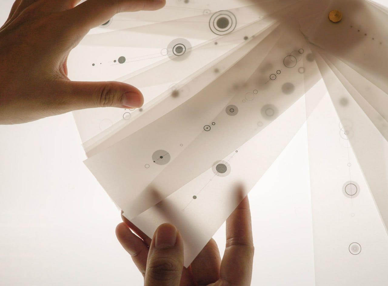
Without Words is a very delicate and beautiful project by artist Pamela Ng, where she narrates her complex four-year relationship. Pamela writes that it was difficult for her to speak about the delicate nature of the relationship, so she expressed her feelings and emotions through symbols. Variations of circles reflect different emotions and mental states: from exhilaration to a sense of disaster. The size of the circle shows how long the feeling lasted. Through these changes in feelings, one can trace how the relationship developed and faded.
It seems like a very fitting way to express the unspoken when words are inadequate.
(Thank you to Nadya Andrianova for the discovery!)
The 2023 State of the Industry Survey Challenge winners!
And one more wonderful piece of news! DVS has published the results of their visualization contest SOTI based on the annual survey of people in the data visualization field! From F&N, Nadya Andrianova and I participated, and there are many other excellent projects as well!
F&N projects:
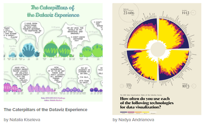
Details and bigger sizes are here:
The Caterpillars of the Dataviz Experience
How often do you use each of the following technologies for dataviz?
I would be very happy to receive your feedback, or if you also love data art and want to share something from this field (news or your project, idea - just write to me!)
Lecture: "Data Art. At the Intersection of Data, Art, and Communication!"
Several days ago, I had the opportunity to give an internal lecture for a telecommunications company on interesting future trends. I talked about data art and its various forms!
I thoroughly enjoyed it! The audience was fantastic, and I want to thank the organizers for inviting me. 😍 There were more than three hundred online listeners, which is probably a record for me, as I usually give lectures to smaller groups!
Interestingly, I also shared my thoughts and examples of modern applications of data art in business.
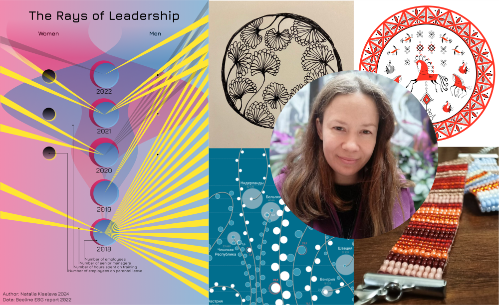
While preparing for the lecture, I had the idea to create a small data art piece for the company, using their open data as an example. The result was this small poster “The Rays of Leadership“.
That’s it for today! Thank you for reading!
You can support our community with a donation or treat the author to a coffee at the link down here: 🌸
