There are data-flowers sticking out of your mailbox!
Yes, this issue is filled with data flowers, data scarves, data emojis, examples of dashboards, poverty leaves, and an incredible art project about Beslan.

Yesterday, during the broadcast on illustrated data art, I talked about one of my long-term projects. It's dedicated to my travels—I spent a lot of time collecting data and was fascinated by how methods of communication and information storage have evolved over the past 10 years. I then illustrated this data by hand on paper as an art project. A year later, I decided to make the project more complex and give it a physical form! I want to share a photo of the work in progress and hope to complete this project in the next couple of months. It has turned out to be quite challenging!

So, remember that every project you love might have a second life—and that’s wonderful! Don’t stop dreaming and imagining!
Flowers & Numbers - News!
Warm Welcome from PFC CSKA ❤️💙

On Saturday, August 24th, at the invitation of CSKA press officer, Anna Ivashechkina (our great data-artist) attended the home match against Akron.
Anna watched the game from behind the goal, and during the break, she talked about knitted data roses and a CSKA player for the club’s vlog.
They also discussed various data art options for the club and its fans. Anna hopes this will lead to a fruitful collaboration. She’s glad she had the opportunity to share ideas with those who are "inside" football ⚽️
Check the details about this warm project here!
New Data Badges from Shamil!
One of our community members, Shamil, created a set of badges for the Flowers and Numbers community! He used neural networks to design a hand-drawn-looking cabinet and then worked in Figma to encode different members' skills and proficiency levels in the colors and vases!
You can check out other community badges on our website!

Hilarious data-themed icebreaker: Chernoff faces!
Our great F&N member Sophie Sparkes is thrilled to launch a fun and interactive data visualization workshop for Charlotte Shearsby’s NHS Arden and GEMs Data Visualization Group.
Participants will unleash their creativity by generating data viz ideas using pen and paper. The workshop will kick off with a humorous data-themed icebreaker: building Chernoff faces based on answers to three questions!
World Data Art News
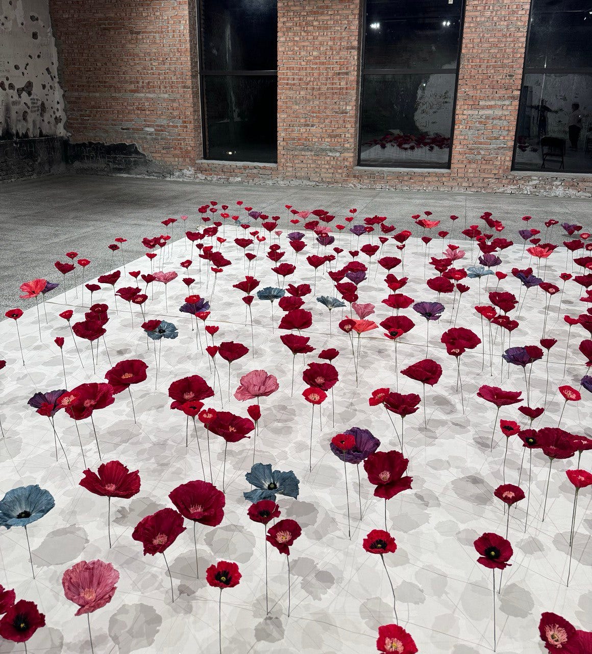
Flowers of Beslan: A Tribute Through Paper Poppies

September 1st marks the 20th anniversary of the Beslan tragedy, the most heinous terrorist attack in Russia’s history. Over 1,100 people were held hostage in a school gym for three days without food or water. The events claimed the lives of 334 people, including 186 children. While we remember each of them, their memory endures.
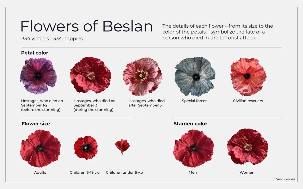
To process the scale of this tragedy and cope with it, Nina Lindell handcrafted 334 paper poppies — one for each victim. The color of the flowers symbolizes the fate of each person during the tragic events. The size of the flowers reflects the person's age — large for adults, small for school children, and unopened buds for preschoolers. The color of the stamens indicates gender — light for women and dark for men. Flowers representing family members are placed close together. These flowers are arranged in the school’s assembly hall, creating an improvised poppy field.
The project took about half a year to complete, with the help of many selfless individuals and the support of the "Mothers of Beslan."
Women in Managerial Positions

Ana Kaiseler’s beautiful project about Women in Managerial Positions! Look at these elegant patterns! The project turned out to be charming, and I really love the natural motifs in data art!
A visualization of poverty levels
How does the risk of living in poverty vary by gender, age, and whether you live in an urban or rural area in a Pacific country? Check out this beautiful interactive project, made by Kristin Baumann on her website.

My projects
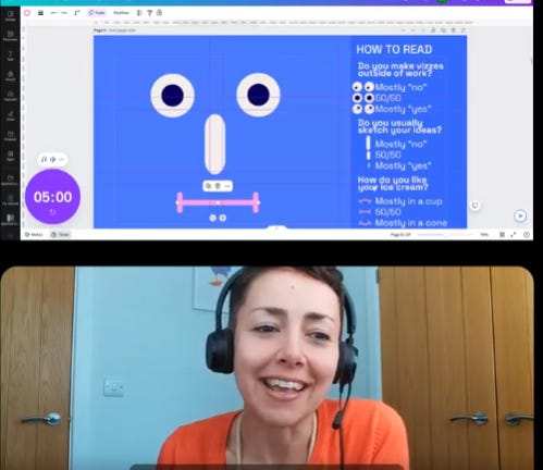
Illustrated Data Art Broadcast!
Just yesterday, the wonderful Sophie Sparkes and I hosted the first international data art broadcast for our community. We discussed projects drawn by hand or featuring illustrations!

Sophie shared her data-drawing projects, where she sketched lectures as data portraits, and I talked about my hand-drawn projects! We also discussed some amazing works from around the world. You can find all the links and watch the broadcast here!
Sophie is just starting her new newsletter, where she'll be sharing her exciting creative approach to data visualization—Data Drawing!
The F&N Newsletter
We've got a lot of new subscribers here! I'm so glad to have you all! I want to tell you about the other newsletters in this project.
The structure of all the newsletters is roughly the same:
Community news about data art
Global news about data art (recent projects)
Updates on my projects and personal news.
Each newsletter usually includes a useful checklist or a collection of interesting data art pieces focused on a specific theme or tool.

You can check out the last newsletters here:
Data Art Practice Link
Who Becomes Data Artists? Link
Simple Tools for Aspiring Data Artists! Link
Data Walks and Data Puzzles! Link
Examples of Data Art in Tableau Link
Beauty in Code: Data Art Projects in R (most popular letter) Link
Data Art Adventures with Dragons and Dices Link
My Tips for Advancing in Dataviz Link
Dataviz League: Gathering Adventurers! Link
Music and Sound Data Art Collection Link
Master's Program in BI and Data Visualization
This spring, I taught BI and data visualization at St. Petersburg State University's Graduate School of Management. The three-month course was conducted in English with international students.
I covered:
Data Visualization Fundamentals
Dashboard Design and Implementation
Tools: DataWrapper, RAWGraph, Power BI, Tableau
New topics included:
Data Storytelling
Gamification techniques
Data visualization trends (VR, AR, AI, etc.)
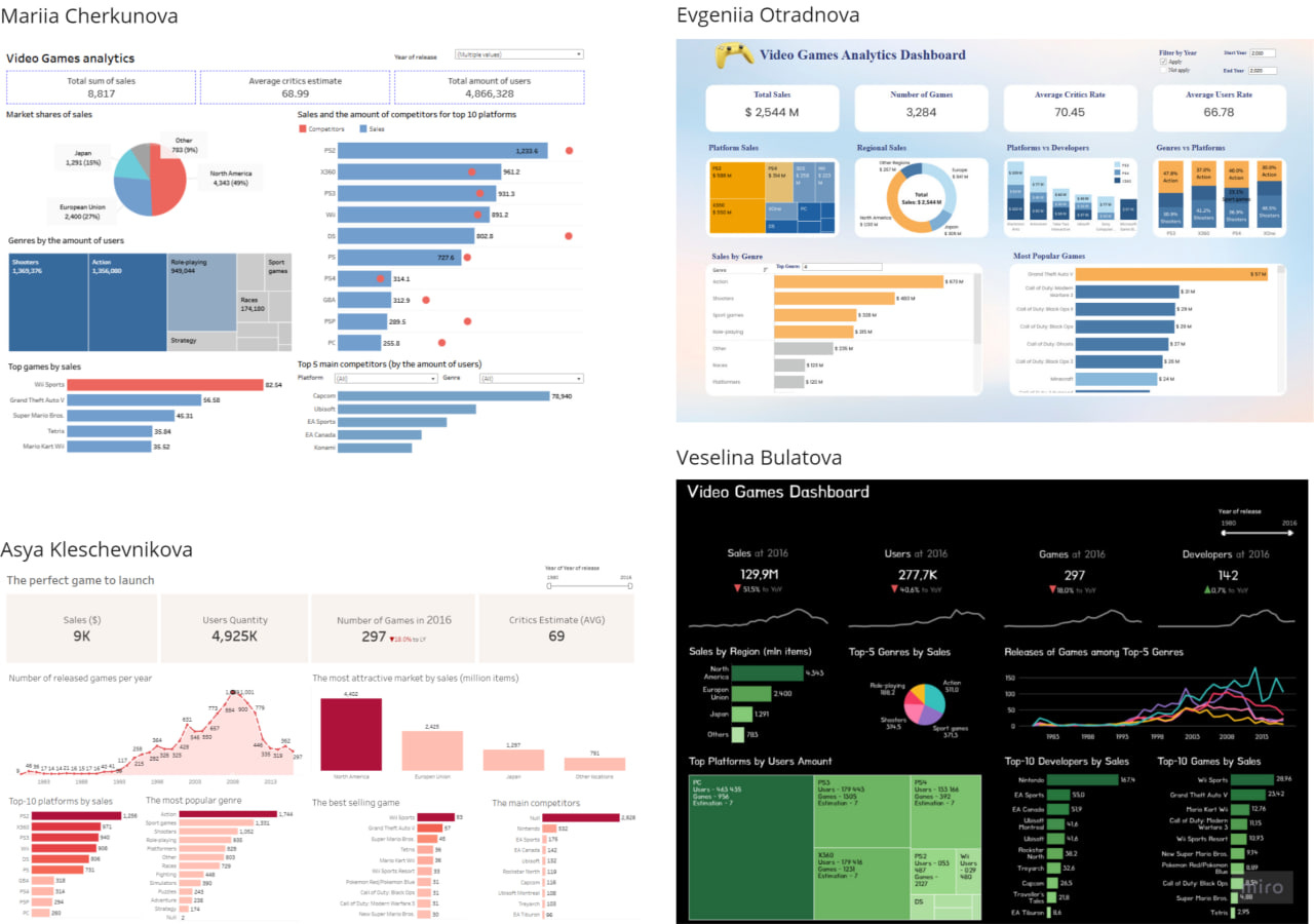
We analyzed global visualizations, recreated cool dashboards in Tableau, and worked on Power BI dashboards and data stories. The final projects on Tableau games were impressive.
Thanks to the Graduate School of Management for the opportunity! ❤️
It's Mathematics!
I'm reading the book Data Sketches and particularly enjoyed the detailed description of Shirley Wu's project about summer movies, which are presented in the form of flowers.

I used to think this project was rather simple, but after understanding the complexity behind it, it no longer seems that way.
😍😍😍
That’s it for today! Thank you for reading! 🌸
You can support our community with a donation or treat the author to a coffee at the link down here: