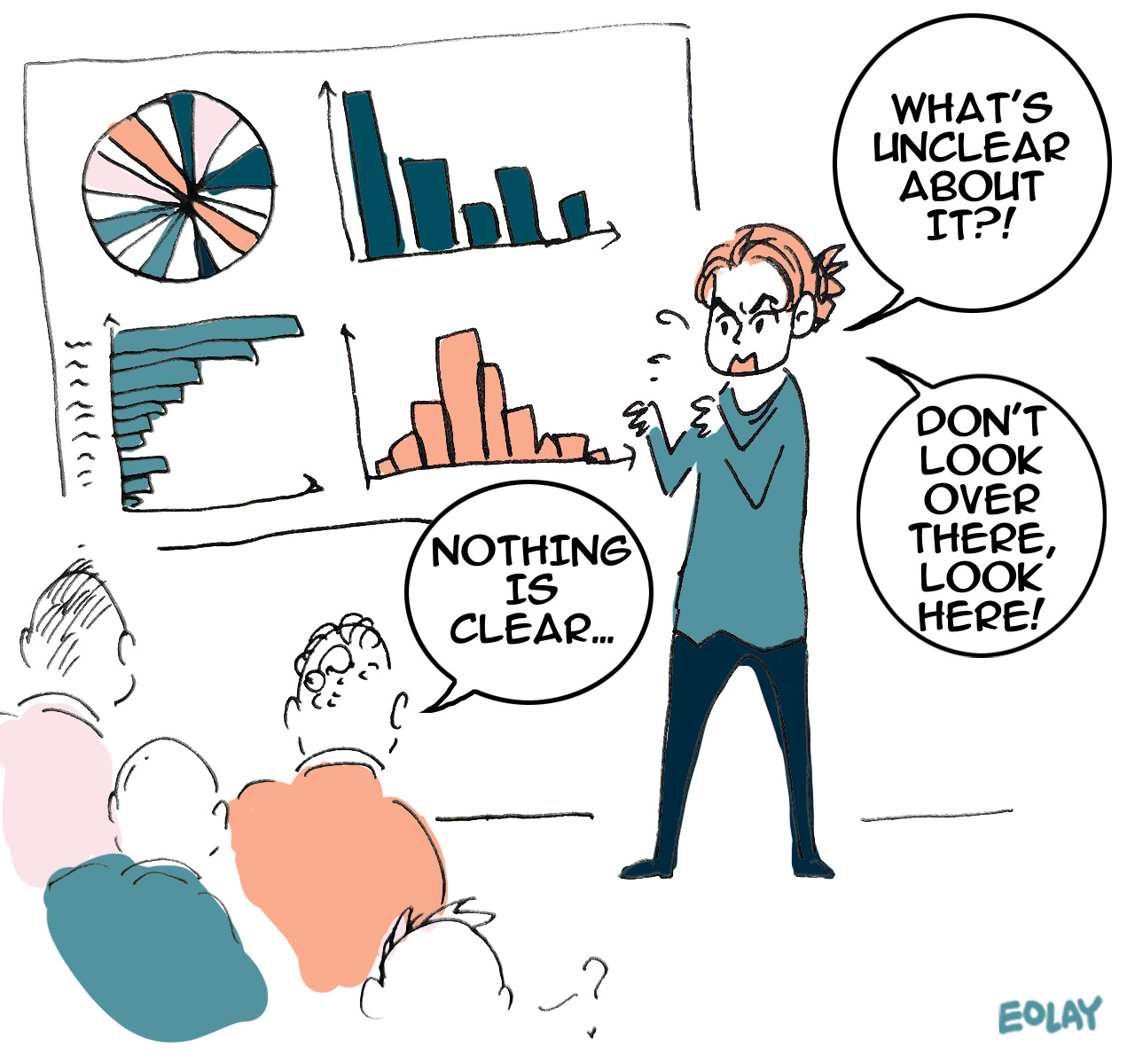
I’m currently diving into data storytelling, not so much from a journalistic perspective, but for slides and presentations. I really enjoy this direction — it’s something that everyone can use in their professional career. I started getting interested in data visualization through this and Cole Knaflic's wonderful book, "Storytelling with Data." Before I started studying the technical side of data visualization, I tried creating visualizations through trial and error. For example, this comic shows a real-life situation! I once presented a dashboard to directors with a pie chart featuring 20 or 30 segments, and I couldn’t understand what was confusing them. Oops.
Thanks for reading Flowers & Numbers! Subscribe for free to receive new posts.
Flowers & Numbers - News!
The summer flew by unnoticed, but in the end, it turned into a turtle
Check this beautiful and cute handicraft data art turtle from our wonderful community member: Anna Ivashechkina!
Anna participated in the summer data-art challenge from "Flowers and Numbers" community, collecting data on her screen time. 🌸
She chose a turtle with a flower-shaped shell to represent her data, allowing her to show both the number of apps in each category and the proportion of minutes spent on her phone over the months.
The final piece is a small, plush turtle. It reveals, for example, that Anna spent the most time in messaging apps, even though they made up the smallest category.
This was her first experience visualizing personal data, and she’d love to hear your thoughts on the project .
Only in data journalism could this happen!
Anna is the hero of this letter, she shared one more beautiful data-story!
In mid-July, the HSE media master's graduates decided to give their program director, Tina Berezhnaya, a data bracelet as a keepsake. Each bead string encoded information about the students, including their initials and gender, for easy identification.
At the same time, Tina created personalized beaded necklaces for each student, representing the 120 credits they earned during the program.
This thoughtful exchange of beaded data-art at the graduation ceremony will forever remind them of their time in the data journalism master's program (2022–2024) ❤️.
World Data Art News
Peer Gynt quilt!
At breakfast in London, a conversation about Ravel's Boléro sparked an idea in the author. Inspired by Anne Adams’ Unraveling Boléro—a painting representing the music through colored rectangles—they thought of making a quilt. Instead of copying, their mother suggested using Grieg’s In the Hall of the Mountain King.
The project evolved into four quilts, one for each movement of Grieg's Peer Gynt Suite. The third movement, Anitra’s Dance, was particularly challenging due to its repeating bars. The author adapted the design to use tessellating triangles, evoking the fluidity of the dance.
Read about the incredible 4-part project dedicated to creating Peer Gynt quilt based on music — made by Ice Moon Prison! All the details in the form of incredible 4 articles about this project, you can read here: link.
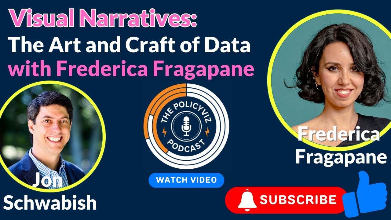
Visual Narratives: The Art and Craft of Data
A new video (and audio) podcast with gorgeous Federica Fragapane and Jon Schwabish! Check this wonderful interview here and here!
After a year-long break, I want to try mentoring through DVS again! The last two times were an incredible experience, and I believe I've become much more helpful to aspiring professionals since then. Now, I regularly give lectures and conduct workshops on data visualization, assist with career growth, self-promotion, and other valuable skills! I hope I can help someone this year and next!
If you didn’t know about this opportunity, check out mentoring through DVS! It’s a very exciting project!
The past month has been quite hectic for me. I have a lot of work, including active preparation for two lectures, one course, and a data-art commission. It’s quite unusual for me to work on commissioned projects like this, so I hope I meet the client’s expectations.
Since I didn’t anticipate such a heavy workload, I enrolled in a graphic design course to fill in some gaps and also signed up for a marketing course! So now, I’m a bit overwhelmed. Whew! Please offer me some moral support! ❤️
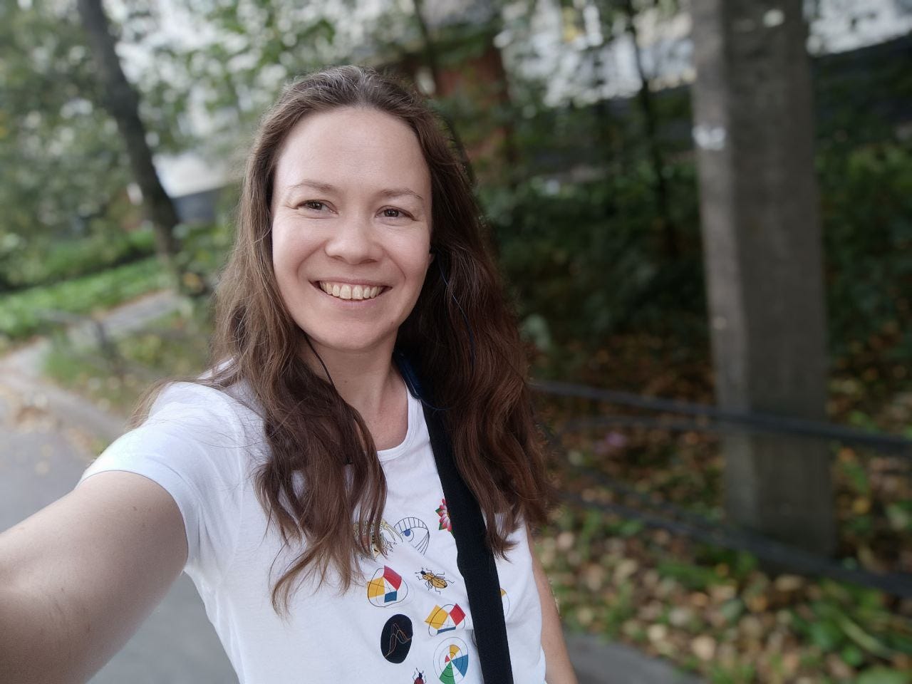
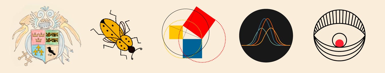
And this summer has been incredibly warm and beautiful! I’m trying to go for walks more often when I have the time. Look, I’m wearing a T-shirt with data badges from our community, "Flowers and Numbers"!
That’s it for today! Thank you for reading!
You can support our community with a donation or treat the author to a coffee at the link down here: