Music and Sound Data Art Collection
How did Aragorn end up making Arwen gray? Data Pottery, Data Art Books, and Data Makeup!
This letter focuses a lot on books. Right now, I’m reading the fantastic book Data Sketches by Shirley Wu and Nadieh Bremer! I think there’s nothing more inspiring than books about data art. For example, from just the first chapters, I got an idea—why not create a project based on a dataset from the example, where the data is captured in a girl's hair? At first, I was just intrigued by the visualization of a dialogue as a streamgraph, but then my hand wavered—and here we are!
Little data art about Arwen.
Flowers & Numbers - News!
Stream about Sound Data Art!
We met with Vladislav Rogulin a generative artist specializing in sound visualization. VK, Zen.
Despite bot clone attacks, we discussed global sound data art projects, Vladislav’s work, and the projects of other Russian generative artists!
Links to the great Sound Data Art projects we discussed:
Crowns and Tears - visualization of Covid
Capturing the Blend - Hennessy V.S.O.P.
Alexey Shulgin - media artist Art Group - zero.404
Tools: TouchDesigner, NodeBox, for material works: Rhino for architects, and the Grasshopper plugin.
The recording is available here!
World Data Art News
Data Pots by the wonderful Maxene Graze!
Data Pottery by Maxene Graze uses data to create texture, structure, and overall composition of ceramic pieces. This involves using internal characteristics of the ceramic itself, such as height, texture, clay type, etc.—not just colors or painted shapes.
These two miso jars come with built-in recipes:
Red clay on the lid = Fermentation time (full circle = 1 year)
Beige clay = Ratio of koji to the substrate
Grey-blue coarse clay = Amount of salt
Material data art is beautiful!!! 😍
Check this wonderful project here: Data pottery
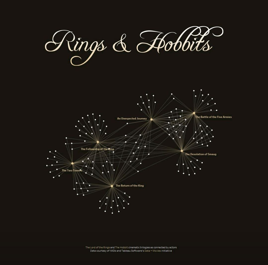
Rings & Hobbits
Network Data Art by Zach Bowders on the theme of recurring actors in the Lord of the Rings movie universe.
Isn't it adorable? 🧝♀️💍 Made in Tableau.
Source: Link
2024 Cycling Honors
Tour de France 2024 results for each stage, and overall results for each jersey. Also includes classified climbs, time cuts, abandonments, and more!
Project by David Rudkin. Tableau link
A Collection and Reviews of Data Visualization Books!
One of the most accessible and reliable ways to become a pro in your field is to read professional books. Check out this wonderful collection by Nadieh Bremer.
Just half an hour a day, and you'll definitely reach new heights 👌✨
https://www.visualcinnamon.com/resources/learning-data-visualization/books/
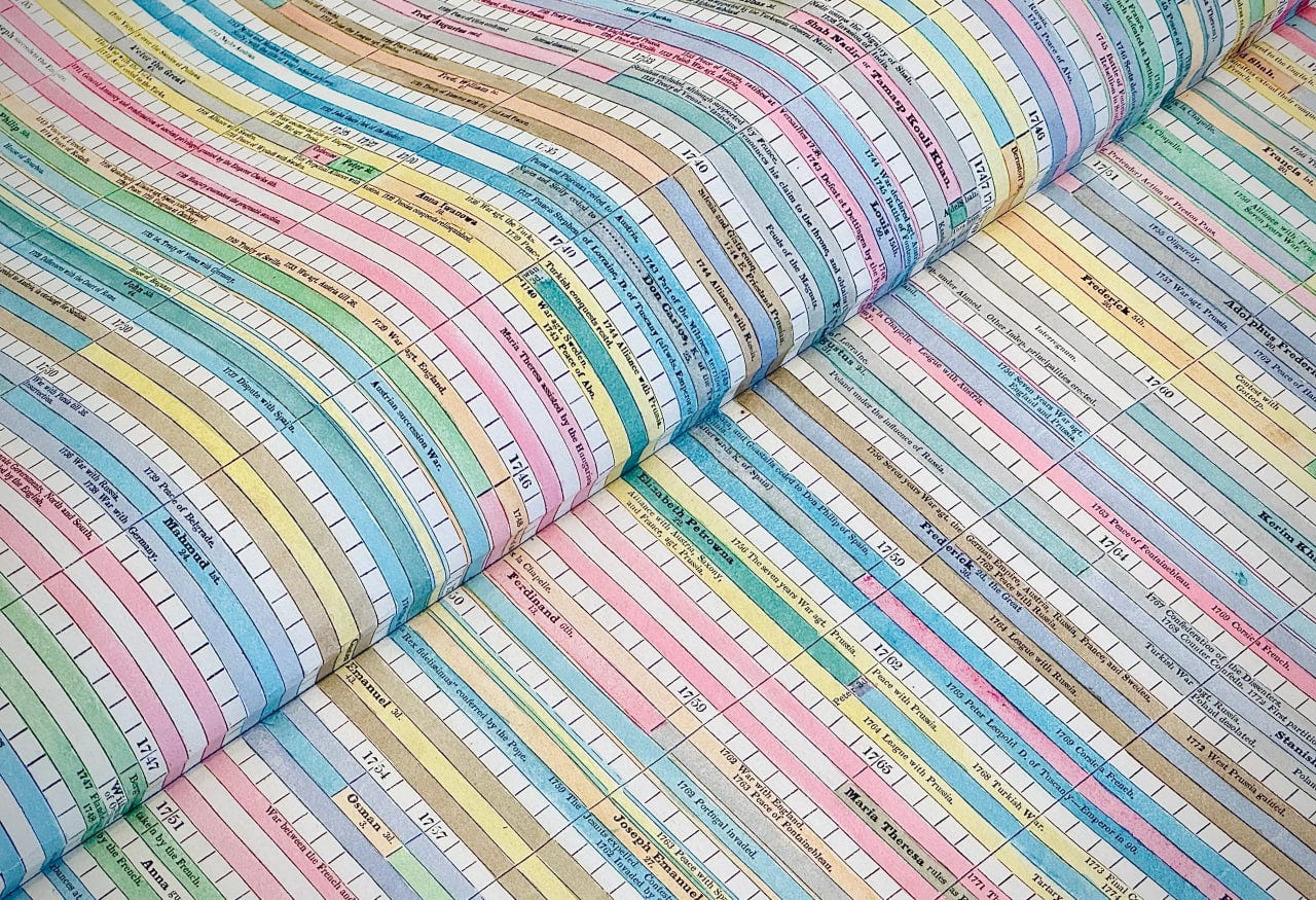
The Marvel of Frances Harriet Lightfoot from 1831
"In 1831, Frances Harriet Lightfoot, a British composer, created a unique chronographic work—a vast and colorful timeline of history. This work, consisting of several large tables, was a significant contribution to the information design of its time. At the age of 29, Lightfoot produced a project that remains relatively unknown to modern researchers. In addition to her chronography, she was also known for her musical compositions and educational work. Lightfoot lived a long life dedicated to music and education, passing away at the age of 71 in 1873."
In an article by the wonderful antiquarian RJ Andrews, you can read more about this incredible work! 😍
Data Art Summary!
The wonderful Sophie Sparkes is exploring methods for visualizing live video streams! She collects data right in the process! It looks like keynote mapping! Remember her Data Portraits? 😍 There, she captured the features of a single speaker's presentation, and now there are several!
It's fascinating to see the different ways a conversation can be presented!
Check out the post about it here!
My projects
Data MakeUp
A quick and spontaneous project, but I think it turned out quite fun!
So I’m sharing it. I’m not even sure how this idea came to me—probably while choosing an eyeliner.
In the end, I decided that a cool alternative to face painting for older people could be meaningful makeup, where you can encode some data in the details of the makeup.
For kids' events, it could be simpler—like favorite animals, drinks, or age.
For adults, it could be more complex—such as professional experience, personality type, or mood.
So, I got the materials, created these mockups, and even tried them on myself. Now I just need to catch a kid and make them sit still for five minutes—then the number of models will increase!
What do you think of the idea? 😁
***
If you want to know more about Data Art Books - check the Data Art Knowledge Base on my website!
That’s it for today! Thank you for reading! 🌸
You can support our community with a donation or treat the author to a coffee at the link down here:


What would also be interesting to tackle is the use of the audio visualization for purely scientific purposes. Here is one example how an object very difficult to imagine, namely a black hole, can be mapped to a sound representation:
https://www.npr.org/2022/05/28/1101763397/black-hole-sound-nasa#:~:text=For%20the%20first%20time%20in,being%20opened%20again%20and%20again.
The link to your discussion with Vladislav doesn't work somehow... Could you please check?