

More Summer Data Art!
Data Jewelry, Data Tattoos, Music, Stones & Fascinating Events!
I'm on vacation, but I’ve saved a fresh batch of data beauty just for you — so you can stay inspired and build up your visual library for your next creative projects!
Tag me on LinkedIn or drop me a message if you’d like your data art to be featured in the newsletter — in case I’ve missed it!
Flowers & Numbers - News!
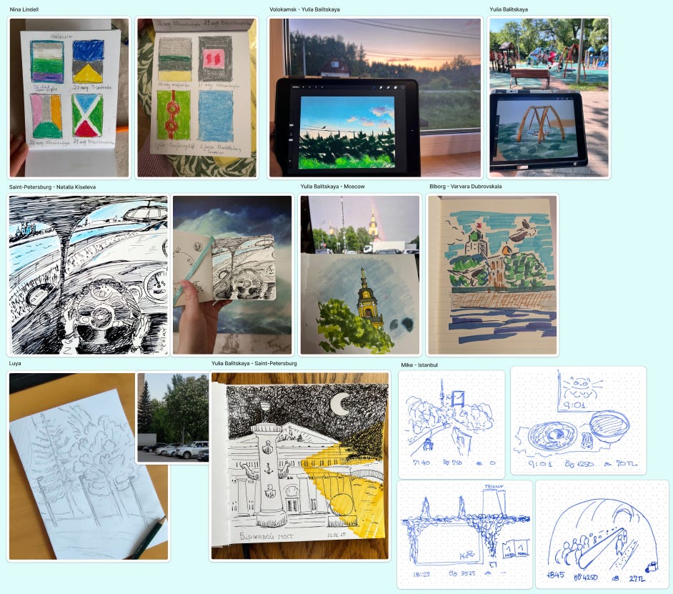
Summer Sketches
This summer, as part of our community activities, we decided to do a bit of sketching of the world around us. Most of us aren't professional artists, so the real value was in simply capturing our surroundings (and our own cities) in any visual form!
Here's a small collection of what we've created so far.
Sketching is a wonderful practice — we highly recommend it to everyone!
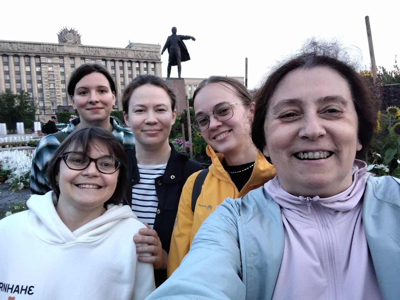
A Walk in Saint Petersburg!
While summer is still so lovely, we decided to meet in person! A small (but lively!) part of our community lives in my city, so we got together — had coffee, took a walk, and chatted about data art projects.
Everyone left with beautiful postcards and great memories.
In an age of endless online meetings, real-life connection feels especially meaningful and precious!
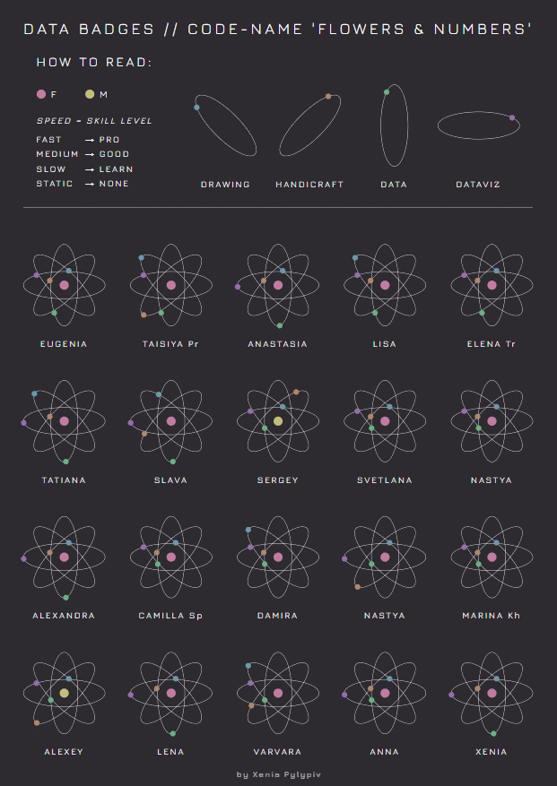
New Comminuty Data Badges!
While the newsletter was delayed (still guilty about that!), a beautiful new project appeared — data pins based on our community dataset!
Ksenia Pylypyv created an interactive concept, even though she’s still new to coding. Inspired (and a bit nudged) by ChatGPT, she built the project using Cursor and shared it on GitHub — also on AI’s advice.
Despite the technical challenges, Ksenia is happy with the result — and so are we!
Check it here full size! Looks cool!
Video about Data Art Jewelry
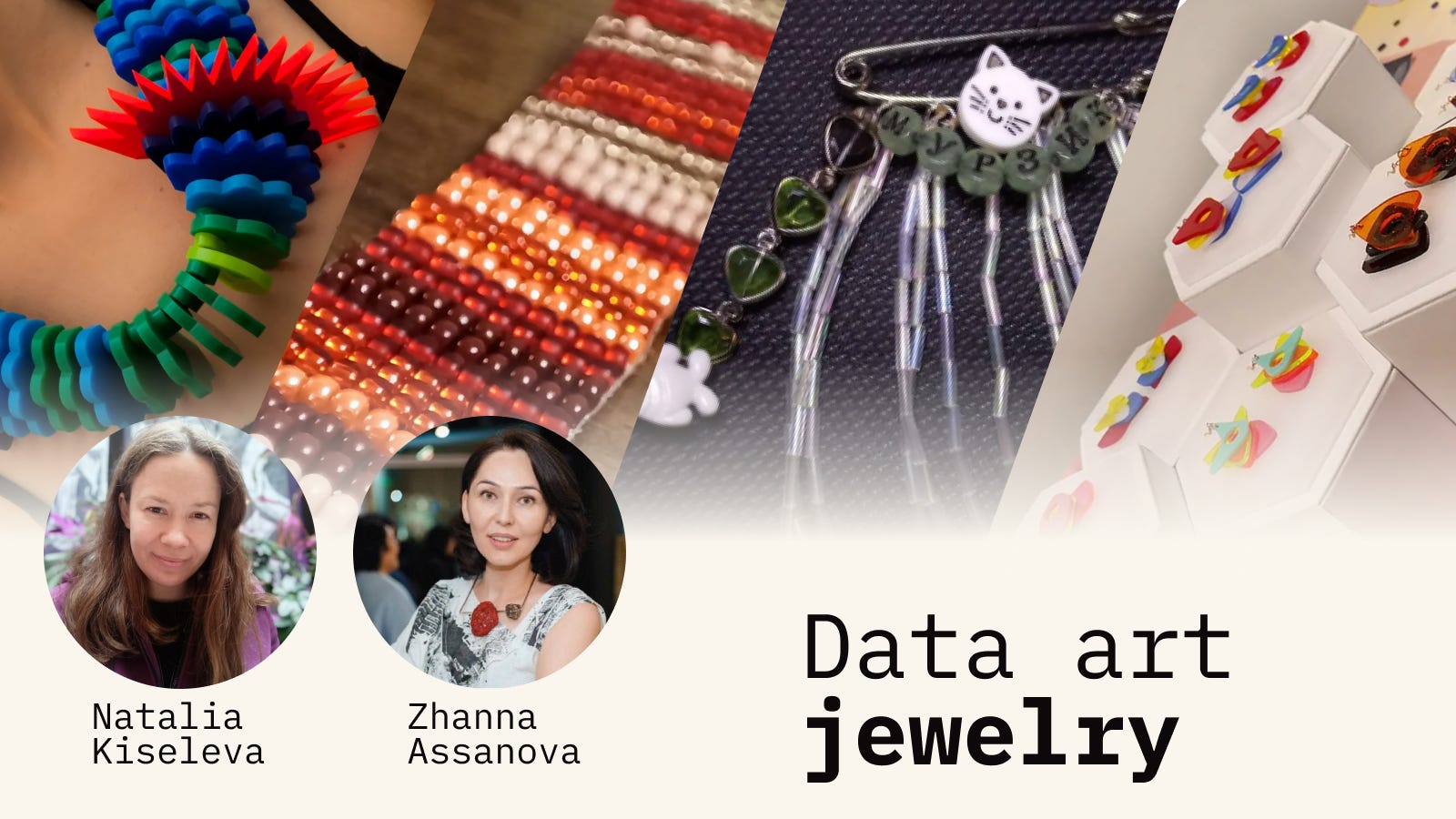
To celebrate the beautiful Data Art Jewelry exhibition mentioned in la, Zhanna (one of the organizers) and I hosted a livestream — all about data art jewelry!
🎥 Watch the recording here (in Russian, but subtitles are available):
Links to all featured projects are also included in the video description!
World Data Art News
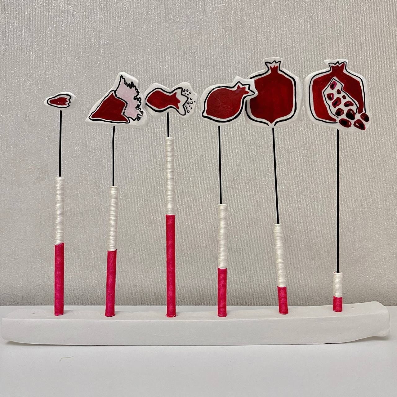
Pomegranate
For the Open Data Armenia contest on physical visualizations, the artist created a piece using the pomegranate as a symbol of Armenia and a metaphor for age. From a small bud (children) to a ripe fruit that has given seeds (elderly), the work connects demographic data with visual storytelling through a culturally meaningful form.
Sonja Kuijpers Interview!
The recording of the livestream with Sonja Kuijpers is now on YouTube! 🥰 It’s wonderful! I love her projects so much!
In it, she shares stories behind several of her projects — Watch here!
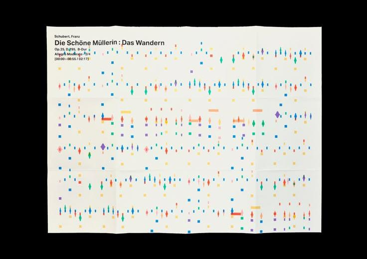
Classical Music Synesthesia
Beautiful project from Valeria Panizza. This is the musical piece by Franz Schubert —
"The Fair Miller-Maid: Wandering".
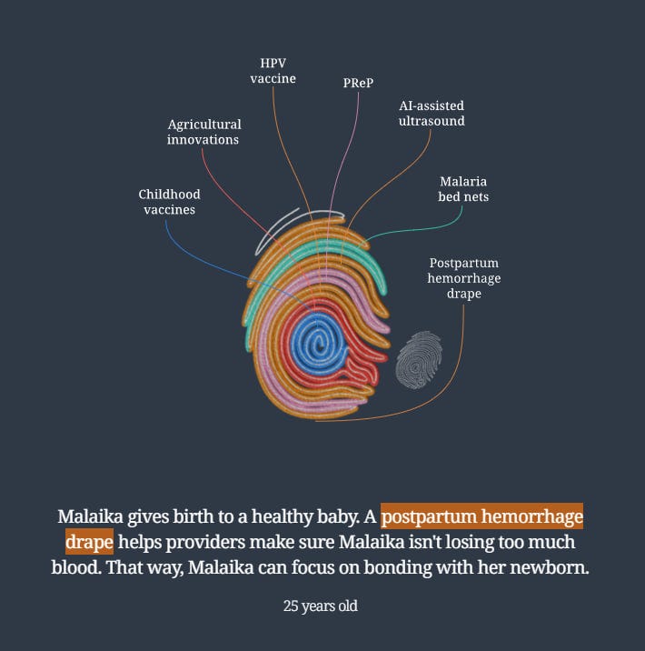
Embroidering Progress
A beautiful new project featuring Giorgia Lupi, with powerful storytelling at its core. It highlights how progress in recent decades has significantly reduced child mortality.
The project combines personal stories, animations, and a unique data-embroidery-inspired chart — both engaging and informative. Explore it here!
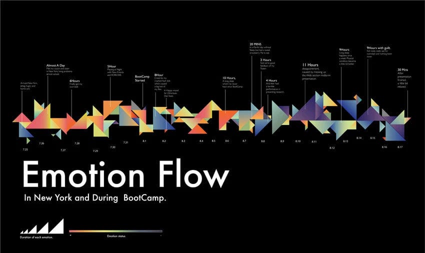
Emotions
I stumbled upon an older project by Joy Wu — a delicate and elegant piece of data art I hadn’t seen before.
In it, color represents the type of emotion, and triangle size shows duration. The data was collected during her time in a bootcamp. View the project on Behance!
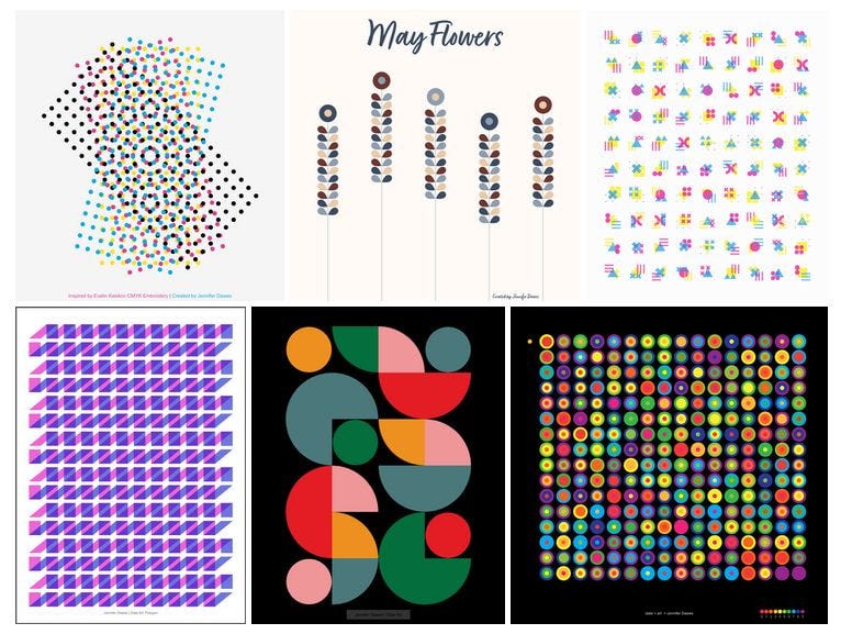
Data Art & Generative Art by Jennifer Dawes
Stunning visual work — not always based on real data, as Jennifer Dawes enjoys experimenting with numbers and polygons, but the results are absolutely beautiful! And with Tableau! Wow!
Details here: Drawing with Data — Reclaiming Joy Through Data Art
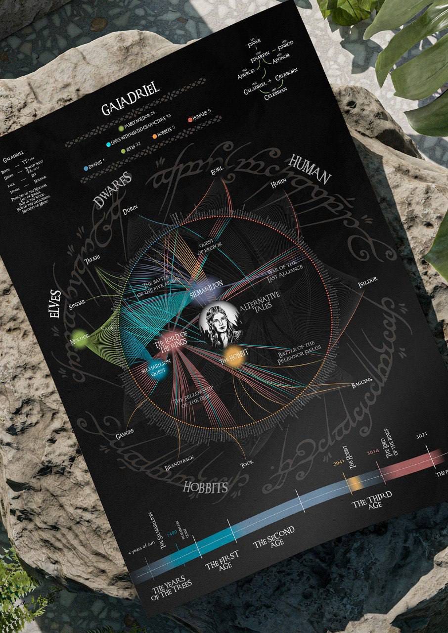
The World of Tolkien — Visualized Like Never Before
This impressive project, “Data Visualization of J.R.R. Tolkien’s Universe” by student Anastasia Sakharova, transforms the rich lore of Middle-earth into detailed, beautifully designed posters.
It maps out hundreds of characters, family trees, key events, and inter-clan connections — making it easy to explore complex relationships, trace character appearances, and follow storylines across Tolkien’s works.
Both newcomers and longtime fans will find these visualizations a clear and elegant guide to the epic world of Tolkien. View project!
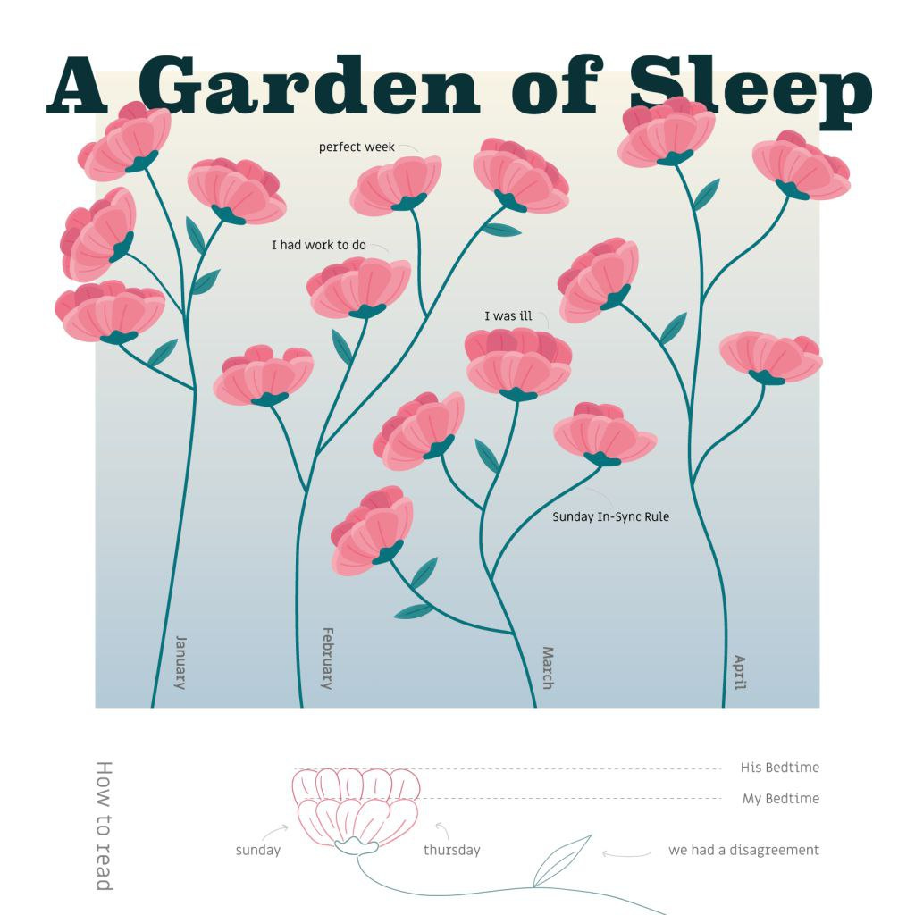
A Sweet Project About Going to Sleep 🥰
The lovely Or Misgav collected simple data from her nightly text messages with her husband and visualized it as a garden of flowers.
A gentle and poetic take on everyday moments, turned into data art.
🌸 Read the article
My Personal Projects
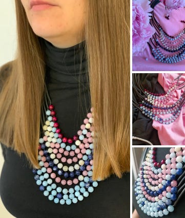
Inequality Necklace 🌟
Just in time, I finished and submitted my data jewelry project for the upcoming exhibition in Kazakhstan!
The set includes a necklace and bracelet visualizing Gini index trends in the 10 largest European countries — red means more inequality, blue means more equality.
As a nod to the host country, the bracelet features data from Kazakhstan. Materials: quartz, tiger’s eye, and sodalite. 💎Full legend and details coming soon!
Data Comics!
I recently had the chance to be a reviewer for student theses, and it was such a rewarding experience!
The students chose data comics as their topic — incredibly fun and fascinating to read.
All of them received top marks, and I’m truly happy for them! 🎉
Wrapped Up a Short Training for SARA Institute! 😍
I recently led a quick training session on Data Storytelling in Excel — and tested some new materials in the process. The feedback was amazing! I hope to write it down or record it soon while it’s still fresh.
Students especially loved the part about guiding attention with color, which I think is key to storytelling visuals. And yes — we made it all work in just 4 hours! 💪
That’s it for today! Thank you for reading!
You can support our community with a donation or treat the author to a coffee at the link down here:
Thank you so much for featuring my work!