Jolly Jellyfishes, Stars, Birds and Wine!
Also Climatic Flowers, Christmas Ornaments new Dataviz Characters

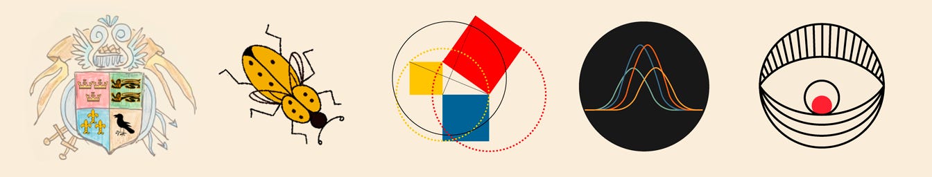
A Little Secret for Starting Your Data Art Journey:
Pick a topic that excites you and one you're knowledgeable about!
Choose a tool you enjoy working with and already have some proficiency in.
Select a style that resonates with you and feels inspiring.
Now, bring it all together! Gather data on your chosen topic and create a piece of data art in your preferred style using your favorite tools. The result? A unique and extraordinary project that's authentically yours.
Yes, it's really that simple. And if you get stuck, Pinterest can be your best friend for color palettes and creative inspiration! 🌈
Flowers & Numbers - News!
Jolly Jellyfish✨
Check out this beautiful project, made by our member: Sophia!
On November 3rd, they celebrated Halloween with a big group. It was a costume party, where participants could choose any look fitting the "underwater world" theme (Sophia, for instance, dressed as a poisonous frog 🐸).
The team went all out with decorations and planning for the evening: they crafted a giant jellyfish from foam and fabric, created an octopus from papier-mâché, organized a themed quiz, and prepared delicious treats.
Sophia felt inspired to join the creative team by making memorable data-art badges for every party guest. Data was collected using paper surveys. 🎨

Featured in Victor Munoz's Wonderful Presentation!
Victor Munoz, a member of our data art community Flowers and Numbers, gave a talk at the DataFam Conference in London, where he showcased various creative projects, including data badges.
He even mentioned our Flowers and Numbers Badge Project (check it out here)! It's such an honor to be included in his presentation—especially alongside Neil Richards on a slide 🥰.
Victor is a digital nomad who constantly travels, bringing incredible creativity to his work. His projects often focus on physical data visualizations and data art pieces. If you haven't seen them yet, take a look here and here. They're truly inspiring!

One Week in Sound
A project by Nadya Andrianova, a member of our F&N community, dedicated to sound, has been featured as the Journal DataVis Challenge's Choice of the Month!
And the wonderful Stefan Pullen has shared kind words about the project! 🎉

World Data Art News
Labels for Between Five Bells by Nicholas Felton
Between Five Bells wine labels, designed by Nicholas Felton, are rooted in a commitment to transparency. Beneath their captivating, dynamic visuals lies detailed and honest information about the wine's composition, including grape varieties, vintage weather conditions, and more.
These labels aim to engage everyone—from novices to connoisseurs—by not only attracting attention but also narrating the wine's unique story through data-driven design.
Every Bird
Jer Thorp creates stunning data art inspired by birds and birdwatching, transforming his observations into exquisite posters.

Wanderings of Stars
Nadieh Bremer shares her reinterpretation of an older data art/generative art project about stars.✨
I absolutely love her projects! And I also really enjoy reading about the process behind their creation in the book Data Sketches! Highly recommend it to everyone—it's such a great source of inspiration!
Check it out here: Wanderings of Stars.

Christmas Ornaments~
I was exploring dashboards (link) by Akane Okamoto and stumbled upon an adorable data art project dedicated to her journey with Tableau. It's interactive—each snowflake hides one of her projects or milestones along the way!
Check it out here: Akane's Tableau Road.
What do you think about creating a New Year's project like this? 😊

A collection of projects by Craig Taylor
Very beautiful projects! I’ve been following him for a long time. What I especially love is that Craig shares the process of creating his projects, as well as works-in-progress!
It’s so inspiring. These blue beads rolling across the map—my favorite (data art style)!
Check out the post here: Craig Taylor’s LinkedIn
His website: Mapzilla ✨
The OECD Better Life Index and World Happiness Index
This #VizOfTheDay by Devi Arnita uses a petal circle chart to compare the World Happiness Index and OECD Better Life Index for 20 countries, highlighting their relationship. Explore this viz inspired by CJ Mayes.

Tiziana’s Newsletter!
Tiziana Alocci, a data artist who enjoys working with sound and circular shapes, has released her newsletter where she shares the process behind creating her projects!

Temperature Data-Art Sweater for a Tree
Nathan Yau highlights an interesting example of data art: a knitting club that makes sweaters for trees in their downtown area. One of the trees was wrapped with a "temperature blanket," where each knitted row corresponds to the daily high temperature of the past year, starting from September 1, 2023. Each color represents a different temperature range. Yau calls for more data to be brought into the physical world, showcasing the creative blend of art and information.

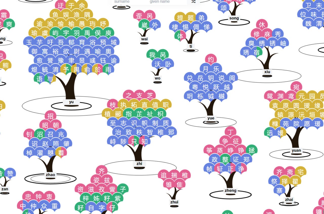
Not My Name!
This is an incredible project combining storytelling and data art! It explores the structure and complexity of Chinese names and their pronunciation.
Did you know that there are four different "A" sounds in Chinese? If mispronounced, words like "mother" can easily turn into something rude! 😱
The introduction is short, but the rest of the project is a fascinating research-based data art exploration!
You can check it out here: Not My Name
Phonetic Catalog of Languages for Duolingo
A beautiful and fascinating project by Amina Bykova!
"Why do some languages seem more melodic than others?" This question was explored through the analysis of the sound compositions of languages. All existing sound groups were encoded with simple geometric shapes of their color to represent languages in "phonetic" stacked bar charts. The more sonorous (melodic) sounds a language has, the more the diagram is colored in warm tones, and vice versa. This catalog reflects the perception of languages and also offers insight into how difficult they might be to learn.

Climate Change in Flowers
A stunning data art project by Annelie Berner encodes climate changes in flower blooms!
As the earth's climate shifts, flowers bloom in new ways. Dry or wet years, sunny or cloudy springs—all affect their growth. The Circaea Alpina, a rare flower from the Finnish forest, could change as the climate warms. Its petals might shift colors, its veins deepen, or it could grow longer or multiply.
What will it look like in 2100? Check out the full project here.

My projects
Project Updates: "Travel"
Here's the progress! It's looking pretty cute, hanging and swaying! But it's time to finish it. I need to align the elements and secure them. We're experimenting with different fasteners: metal, epoxy resin, glue... and it's tough!
I thought I could get it done in a couple of hours, but it's been lying on the kitchen table for a whole day (I had to move the table). In my northern city, there's very little sunlight, so UV resin won't harden (oops!). I had to urgently borrow a UV lamp from a neighbor. Found a very low-powered one, so now I'm drying it!
Wish me luck!

RAWGraphs & Figma. New DataViz Characters!
Hooray! I’ve added new characters to my project on personifying data visualization tools. Now this pair is included! Although I haven’t added them to the website just yet.
Personally, I adore RAWGraphs. It can produce some wonderfully quirky visualizations that work perfectly as a base for refinement in Figma.
Why RAWGraphs is Awesome:
Ideal for prototyping simple and complex visualizations.
My go-to tool for creating prototypes for data art or intricate visuals.
Completely open-source, free, and browser-based—no registration required!
Its personality is solid and a bit grim—not as friendly as some other tools, but it’s steadfast and skilled in sophisticated techniques.

That’s it for today! Thank you for reading!
You can support our community with a donation or treat the author to a coffee at the link down here: