


Car Accidents Flowers, Helloween Data Monsters, Moon and Beads!
Podcasts and Postcards, Saturday Night and Data Portrait, Stevie Wonder and Solaris!

Woohoo!! I have exciting news! My article about the data art project Death by Car Accidents has been published in the amazing Nightingale magazine! And in print, too! Now I’m waiting for my copies to make their way to me from a distant northern country where they’re currently visiting.
Flowers & Numbers - News!
Beautiful stones and a data-viz gift!
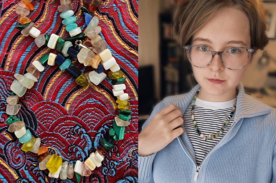
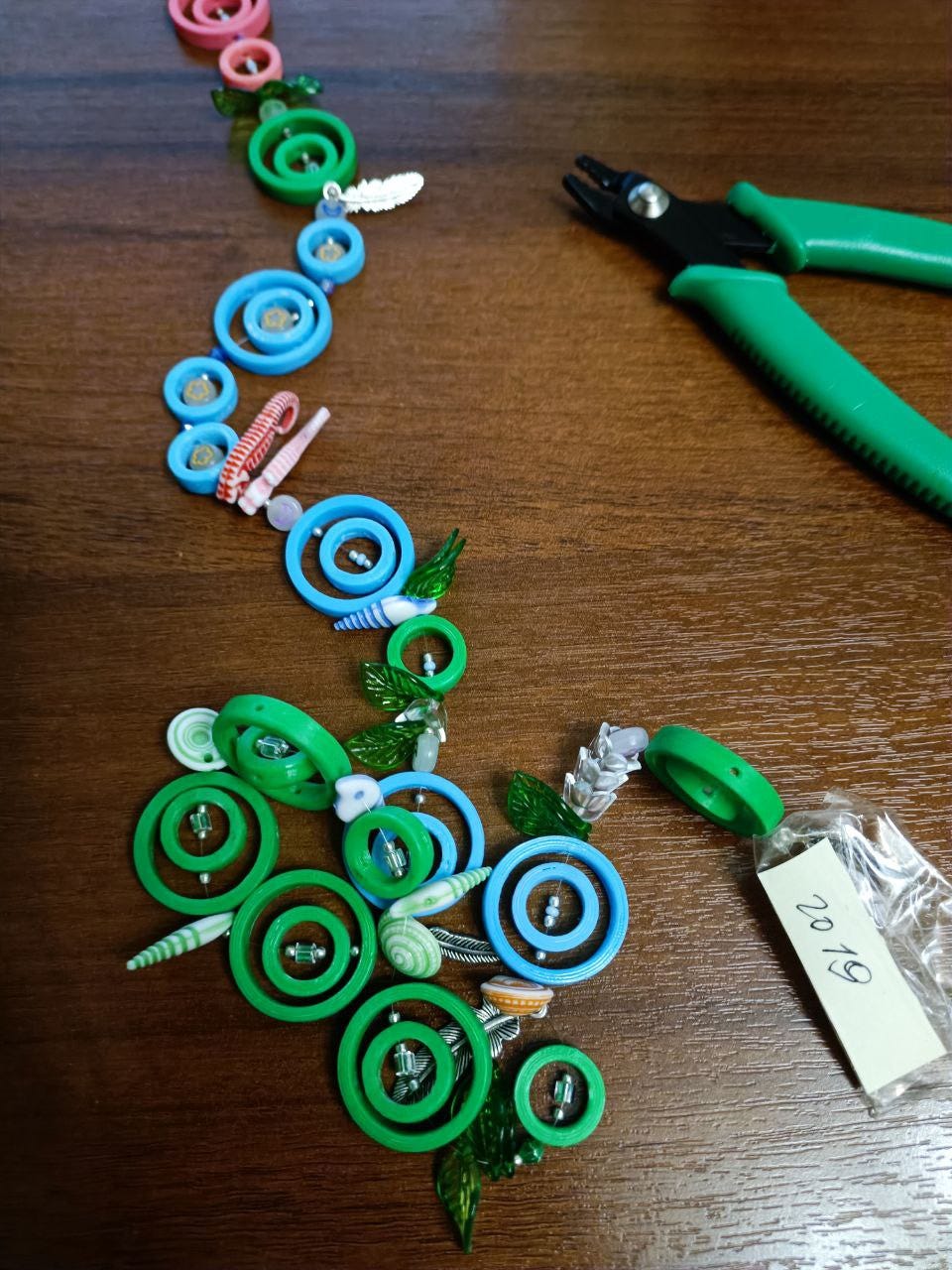
Sofia, a member of the "Flowers and Numbers" community, recently shared exciting news. Her colleague Nastya Nilova created a unique data-inspired gift: a necklace featuring stones representing various projects Sofia worked on at TASS. Nastya collected data on each project type, counted the number in each category using a pivot table, and carefully selected stones to represent each one.
The process was intricate—Nastya sourced 128 stones in different colors with help from a store consultant, even returning the next day for a missing piece and additional materials for a legend. Currently, Sofia wears it as a necklace but is considering adding attachments to transform it into a glasses holder, making the piece even more versatile and visible.
Data-Postcard in Sweden!
Our international postcard exchange is going strong! The Data-Postcard Project, where I send postcards with our community logos to members of the data art community and collect data on delivery locations and travel times, has grown!
Soon, we hope to create an intriguing data art project based on this data!

Data Tarot Birthday Cards!
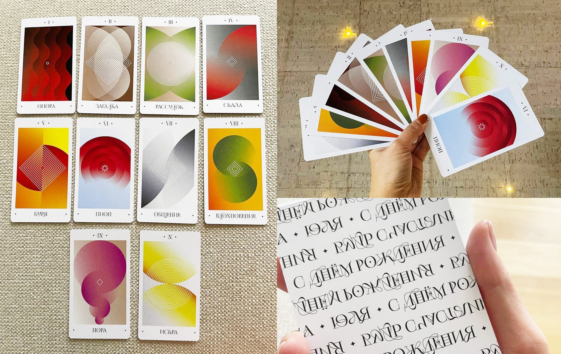
Nadia created a unique “Data Tarot” as a gift for her friend Yulia’s birthday, capturing how each guest at the party views her in a set of custom cards. Nadia designed a questionnaire with seven questions for the guests, asking them to describe Yulia in colors, emotions, and a single noun. These answers inspired each card’s visuals: the two colors each guest chose form the palette, the noun became the card’s title, and an emotion inspired the card’s geometric composition.
The cards also feature symbols representing each guest’s connection with Yulia—the shape shows how they met, and the number of repetitions signifies the years of their friendship. Nadia included each guest’s favorite trait about Yulia and a personal wish, adding these meanings to the cards. Yulia can now draw a card any day to receive a personalized message filled with positivity and encouragement.
How to Gather Data on Color?
Liza Goryaynova from our community recently completed a fascinating research project on Van Gogh! Now, she’s sharing a script that helps collect color data from a set of images (whether paintings or photographs). This is an excellent dataset for data art!
For more details, you can request the script from Liza on LinkedIn!

Her amazing project on Van Gogh can be viewed here!
World Data Art News
Podcast with Jon Schwabish!
A little bit of bragging here—I'm going to make this news global, not just personal! The incredible John Schwabish invited me to his podcast, where I talked about my career journey, from engineer to data visualizer, and then from dashboards to data art and teaching! You can listen to the podcast here! And here! And watch it here!
Also, don’t forget to subscribe to John’s amazing
!
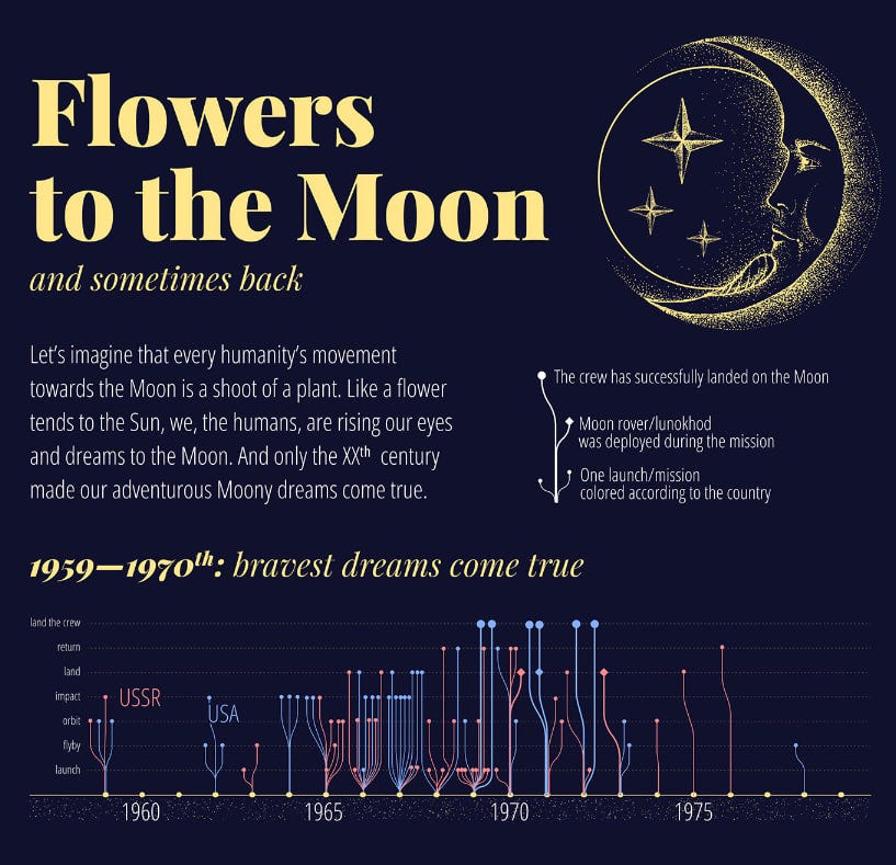
Visualization of the Apollo Space Program
Visualization of the Apollo Space Program and the Moon Missions by Set Reset ✨
Their work really impressed me — everything is so round, delicate, and beautiful. Perfect for hanging on the wall and admiring!

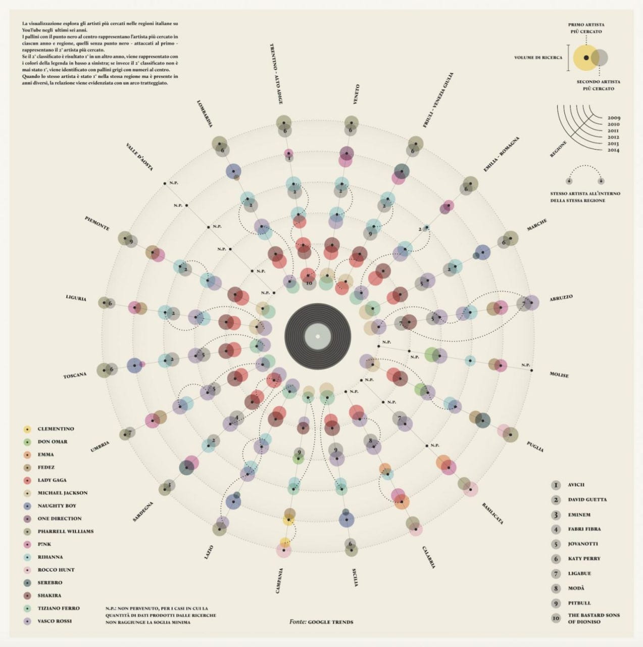
Saturday Night Fever
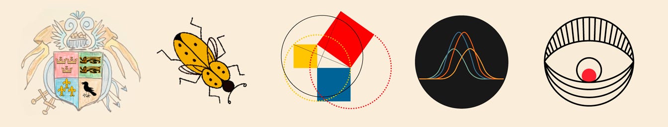
Valerio Pellegrini and Michele Mauri (2014)
This visualization displays the most popular music artists based on search queries in each region of Italy from 2009 to 2014. Each circle represents a year, and each axis represents a region. Each pair of circles shows the most popular artist in the region (in the colors shown in the legend at the bottom left) and the second most popular artist (in gray, shown in the legend at the bottom right).
Data Portrait by Sofie!
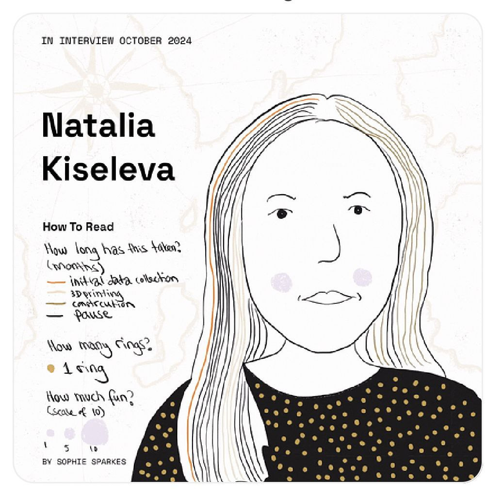
Had a fantastic time with Sofie Sparkes, chatting about data art and my Travel project! (Photo with material part is below). During our interview, Sofia gathered data from our conversation and then created this unique data-portrait of me! Isn't it amazing?? You can watch and listen to the full interview here! LINK
She has her newsletter too!
! More dataviz newsletter!Stevie Wonder Cluster Analysis

From albums to singles, explore Stevie Wonder through data. This #VizOfTheDay by David Rudkin uses petal and lollipop charts to cluster his studio work with Spotify data.
Scores for the film Solaris!
Very beautiful, and definitely qualifies as data art, in my opinion, so I’ll leave it here! Sadly, the source is lost. I’m sure there’s more of it out there!

Data Art TED Talk!

Giorgia Lupi spoke at TED about long COVID, visualizations, and perhaps even data art? Let’s go watch! 😍
Data art from Halloween movies!🎃👻

A wonderful project—just look at these amazing colors! And not scary at all! Made by Caterina Caccavale.
Flowers on the Walls
A wonderful project from IIB, made by Alina Djous Golovina, brought to me by one of the students in my data storytelling course. I had missed it before, but now I've saved it in my data art collection!
My projects
Material Problems!
My Travel data-art project, which I mentioned earlier, is still in progress. I’ve been struggling with securing the elements on the fishing line for several months now. I'm using metal crimps, and now I might even need to use epoxy resin. I hope to finish by the New Year—or by spring? I'd really love to have it ready in time for IIB...
Minimal motion effects 😎✨
Here’s some storytelling and scroll-telling for you! Yes, it's one of those 'I have no time, so many things to do!' moments… but I had to make a beaded project that popped into my head in the middle of the night.
So, yesterday after work, I quickly recorded (2 gigs of video!! and that’s not even all of it! My phone wasn’t thrilled!) and edited early this morning. Picked up a couple of new tricks in CapCut along the way. Initially, there was sound, but it turned out a bit creepy, so I cleaned it up (except for the 7-second mark, where there’s a nice ASMR moment!)
Here’s my mini-project! It’s rough, of course! But what do you think of the idea? ☺️
Data viz monsters!
I created them for Halloween!
Look at these cuties! What do you think is the best name for them? Scarygrams, horror plots, or zombie charts? (These are the three most popular names in our community based on a recent poll.)

Journey and a lecture on data storytelling!
In recent news, I traveled to Moscow to give a lecture on data storytelling. It even turned into an international event, with attendees from different countries, so I had to present in both languages! It was really amazing and interesting! I also had the chance to meet Nyura from our community there!
I did get a bit sick along the way and only recently recovered. Wish me good health!

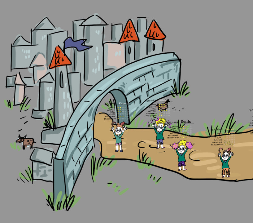
I launched my first personal online course!
This is a course on data storytelling, where I teach the basics of data visualization and storytelling with data. I’ve also added some gamification elements! Students embark on a data-viz adventure! I hope this will motivate them to complete the course, as that’s an important aspect I always worry about.
Do you think it will work?
That’s it for today! Thank you for reading!
You can support our community with a donation or treat the author to a coffee at the link down here:
Book marked this to go through it properly tonight! So many great projects and links in here!