

Beauty in Code: Data Art Projects with R
Exploring Data Art's Potential Across Data Landscapes, Data Illustrations, and More

Recently, I wrote about data landscapes! These are incredible projects, and I even tried to create something similar myself. Now, I've gone further and added a data comic and some storytelling to the data landscape! I hope you like the idea. I believe that if you enjoy something, it's worth trying to combine it — you'll probably end up with something truly delightful!

Beauty Created With Code in R!
As useful content, I want to show you several examples of data art created with or involving R!
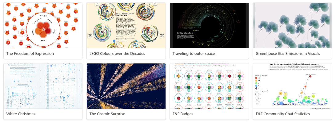
LINKS: The Freedom of Expression, LEGO, Traveling to Outer Space, Greenhouse Gas Emissions, White Christmas, The Cosmic Surprise, and Evgeniy Materov’s projects for F&N!
Special thanks to our active member Evgeny Materov for the links on generative art, check these beautiful examples!
Flowers & Numbers - News!
The wonderful Nastya from Nasten Graph recommended our community as a way to find friends after university! She wrote a touching and useful letter that I completely agree with! To feel happy, it's important to have a community where we feel comfortable and can share and express ourselves. Finding such a place becomes more challenging as we get older! So, it's great that in the data visualization field, there are communities you can join!

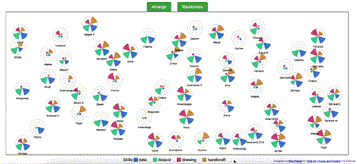
Data-dandelions!
Check out the new data art projects by Evgeny Materov from the F&N community! In my last letter, you saw his beautiful data badges!

Here, each chat participant is represented as a "dandelion": the taller the "stem," the more messages in the chat, and the size of the circle is proportional to the number of characters. Let's call it a dandelion chart.
It's implemented in ggplot2 with the help of {ggtext}, geom_diagonal from {ggforce}, {ggfx} and {viridis}! If you want to know the details - check Evgeniy’s post about it.
A Video About Community Data Portraits!
We recently had a live stream with community members in Russian, where they shared how they created their icons! It turned out to be very interesting, and I hope to host another session like this soon! You can watch it here.

It was also great to learn how Mike created his interactive, self-updating community portraits using ChatGPT! Look how adorable they are! You can check out the interactive project here.
World Data Art News
As this letter is already quite lengthy, I'll mention just one author and two projects that I really liked! This week's discovery is the wonderful Francesca Sanna and her projects featuring floral motifs and data illustrations! Check out these fascinating works! Check these links: LINK1, LINK2!

My projects
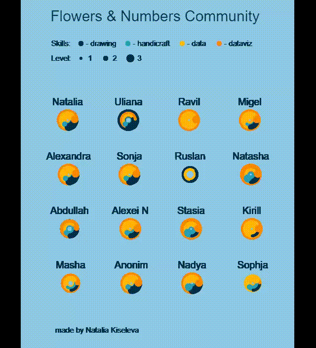
More Data Badges!
For the past few weeks, I've been studying p5.js—creative programming—with the wonderful Data Garden community! Of course, I'm immediately trying to create data art about our community. For instance, I attempted to make automated animated badges. I also have static versions, but I want to tell you about one example where a mistake led to an even more interesting result!
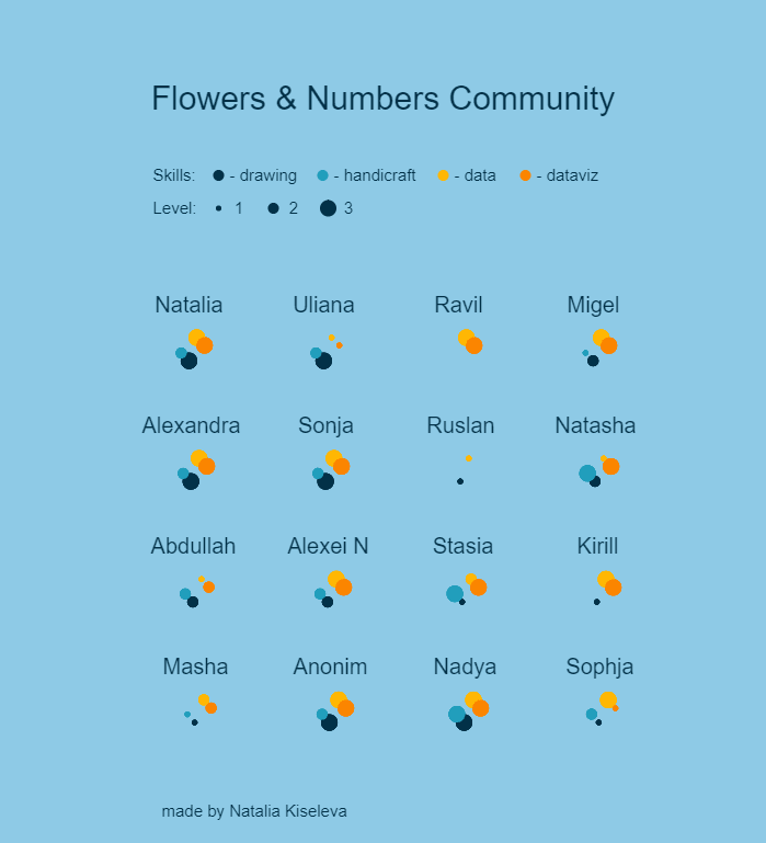
The first GIF shows what was planned, and the second one shows the result with an error where I incorrectly placed the background fill function. But I liked it so much that now I want to implement this version, although it's not easy to do without duplicating the text, for example. But I'm working on it! I really enjoy it! I recommend everyone try Data Garden's free course!
Mezen Family Tree Data Art!

This is my first big data art project, where I encrypted my closest relatives using symbols from Mezen's painting. There’s even an article about the first version of the project in Nightingale Journal, and it has made it to various award shortlists and longlists. It’s quite gratifying. 🥰
I'm now preparing files for printing—I want to hang them on the wall and maybe even make a T-shirt. I think it's cool to have something that tells the story of your family—heartfelt, without unnecessary details. Essential when your family is far away.
You can read about the project and its creation story here.
Yandex DataLens Meetup
I recently attended an interesting meetup about one of the new data visualization tools. It’s a cloud service that is rapidly evolving. I feel like I need to start learning how to work with it! I’ve touched the product and listened to interesting speeches by my friends and colleagues!

YouTube Petals
I finally finished the project based on my YouTube history. I started it during our in-person workshop in St. Petersburg but didn't complete the legend. And now, I've taken this challenging step! Look, it turned out to be extremely charming!

I classified my YouTube viewing data for the month by topic and video length, and this wonderful project came out of it!
I mostly listen to socio-political videos - Shulman and Raksha dominate here. There's also a surprisingly large chunk of marketing content, even though I only follow one author. Strangely, the data visualization content is modest, but honestly, it was a non-data-viz month! :D
What do you think of these petals?
That’s it for today! Thank you for reading! 🌸
You can support our community with a donation or treat the author to a coffee at the link down here:

А почему the F&F community? F&N?