Beautiful Data Art Collection!
Data Art Collection! Children’s Dataviz Contest! My New Book! Beaded Data Art!
I must admit — the more there is to do, the less often I write this lovely newsletter.
But still, I want to share how the data art world is doing this autumn — and the answer is: wonderfully!
This fall, we hosted a children’s dataviz contest, my book was published, and so much more! Read all the details in this letter!
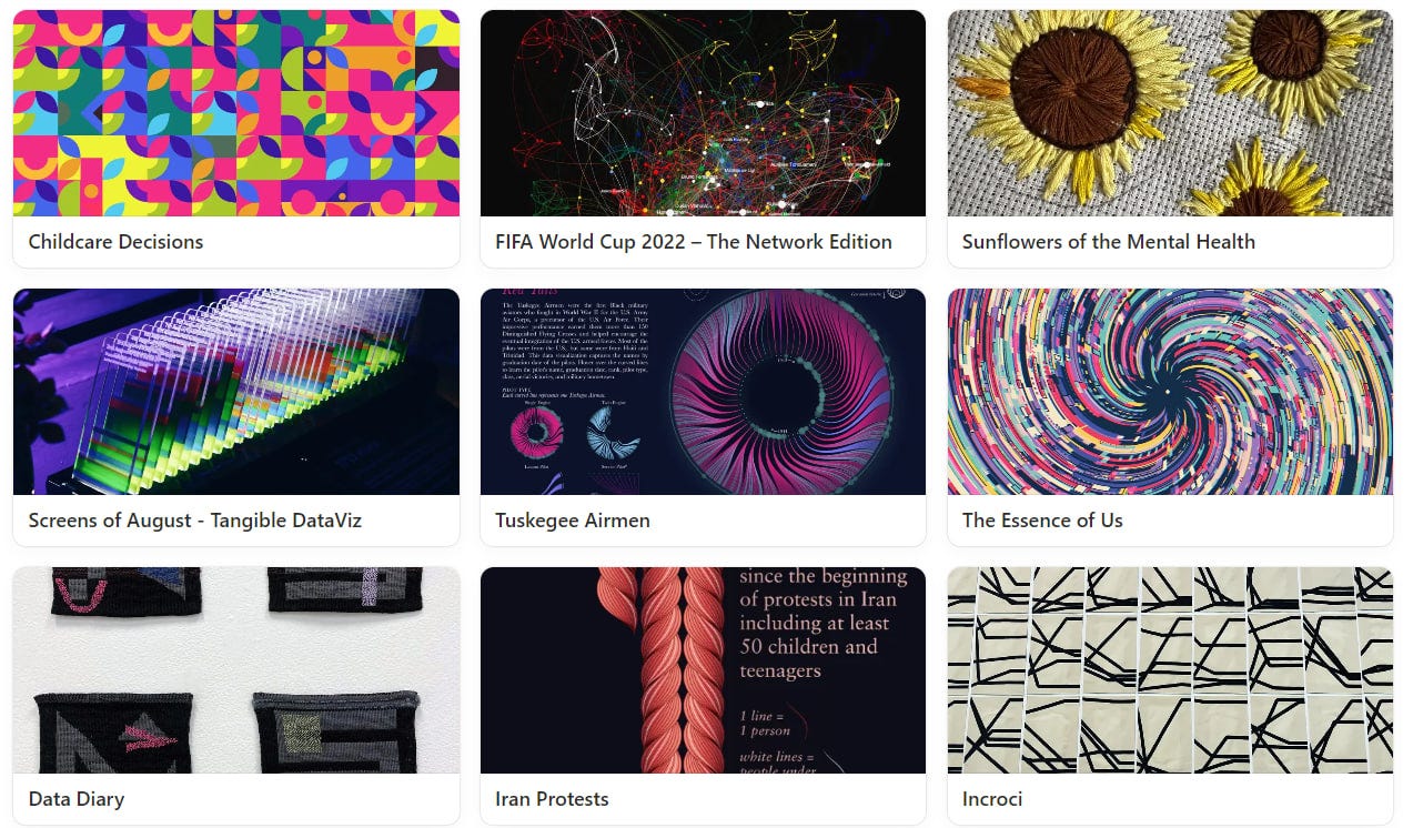
For some inspiration — I finally published my data art collection on Notion!
You can explore and enjoy incredible projects from around the world right here:
Flowers & Numbers - News!
Data Art Jewelry Exhibition!
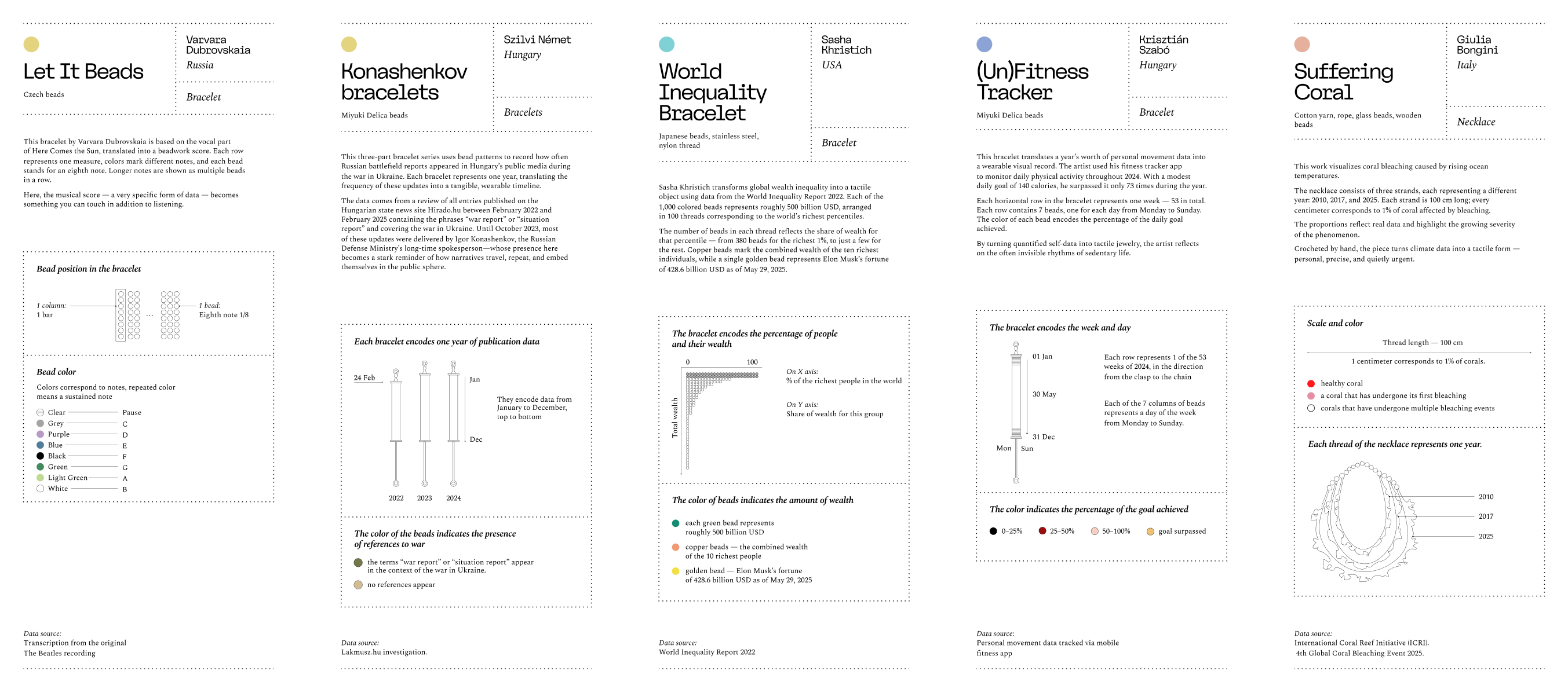
An incredible event our community was proud to contribute to — “The Jewelry Code: Data as Wearable Art”, currently on display at the National Museum in Astana.
More info!
The exhibition runs until December 2 — so if you’re near Astana, there’s still time to visit!
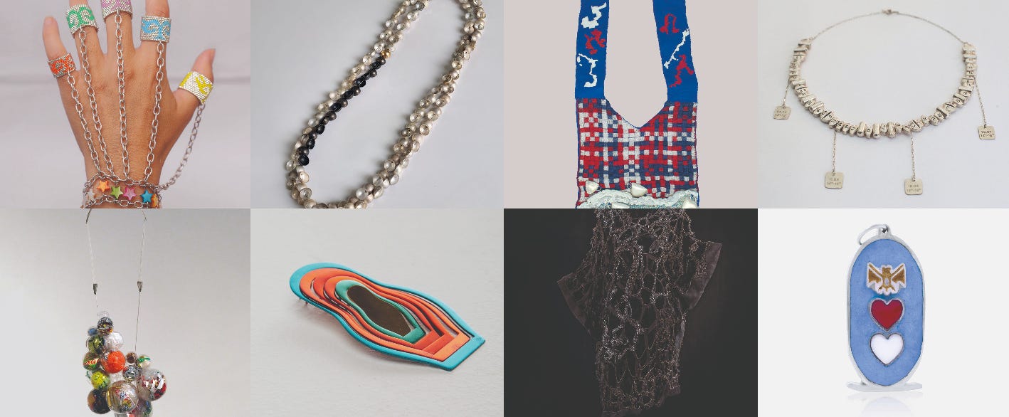
The exhibition organized by Zhanna Assanova features over 80 data art jewelry projects! Each piece is wearable and encodes data — either on important societal issues or based on the author’s personal story.
Our community helped the organizers create legends for all 80+ projects — in a unified visual style. Not all authors had ready-made legends; sometimes there was only a short description. So it was quite a challenge — but the result turned out beautifully!
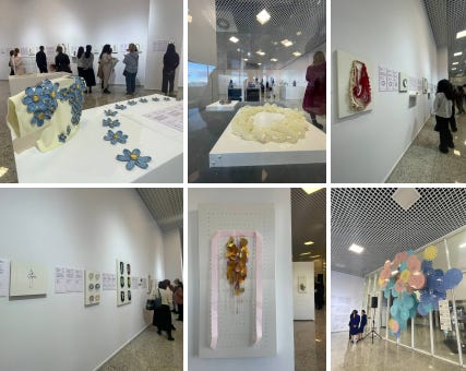
In the end, the legends were unified in a consistent style, and the color at the top also encodes the project’s theme. It wasn’t easy — but we did it!
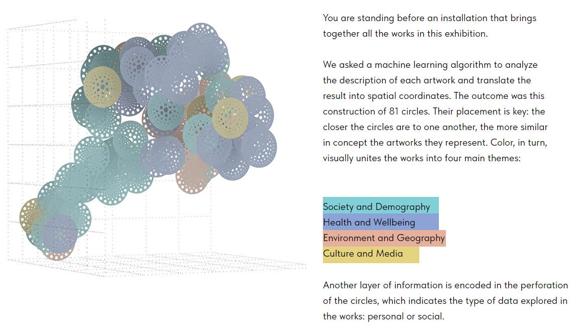
You can explore the virtual exhibition here! Even the photo zone includes data about the projects — just like the “installation” on the website!
I’m so glad that my project was part of the exhibition too!
Photo source
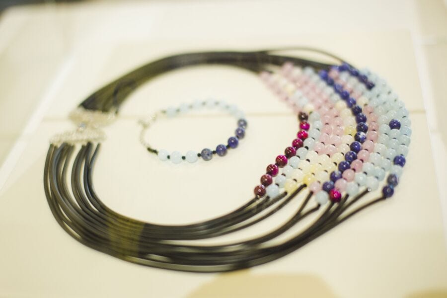
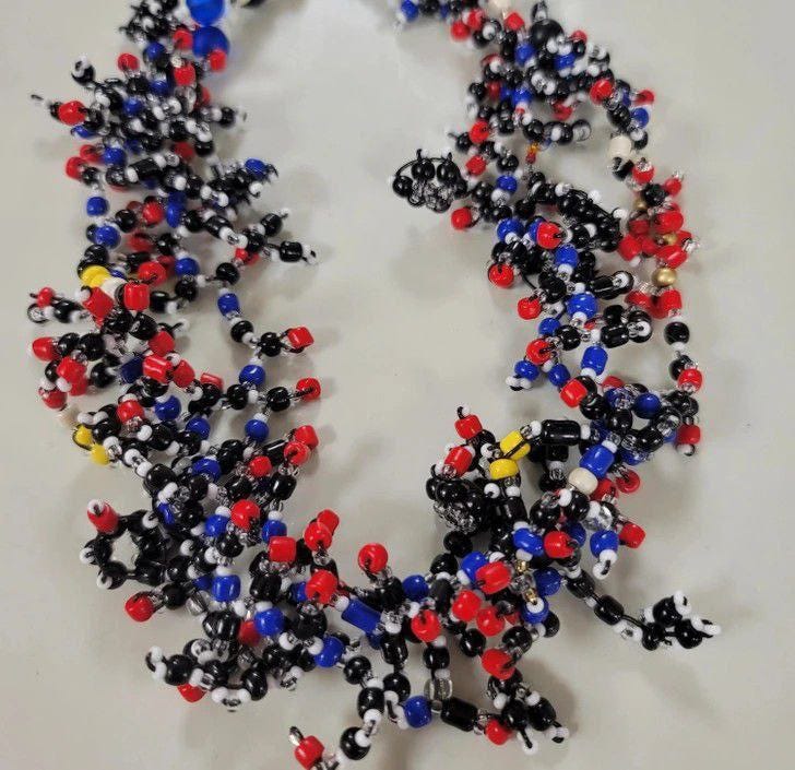
My data art necklace “The Sparkle of Inequality” visualizes the dynamics of inequality in the 10 most populous countries in Europe. There’s also a bracelet about Kazakhstan — a tribute to the wonderful exhibition.
Waiting for my postcard!💌
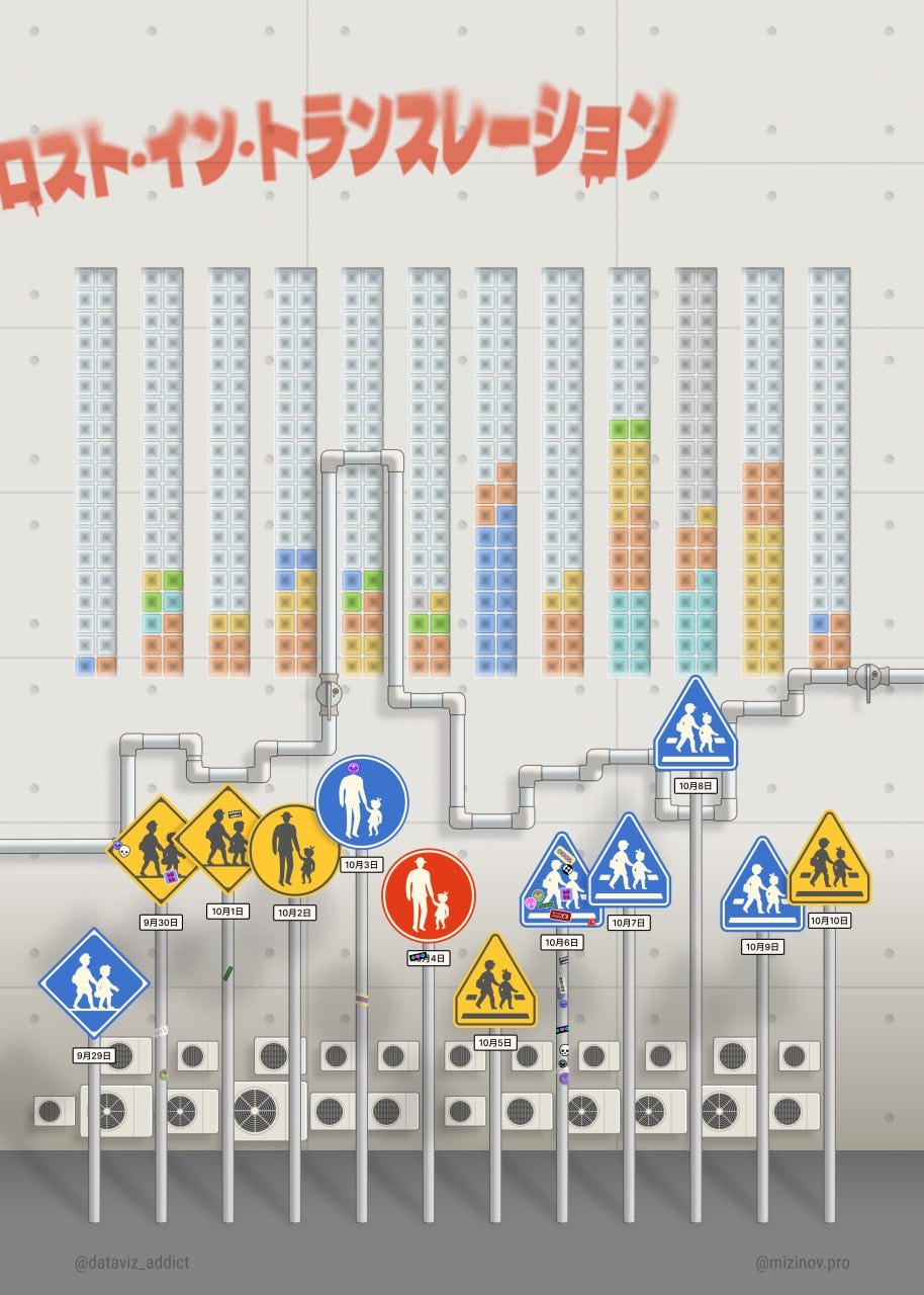
In our data art community Flowers & Figures, we organized a postcard exchange — I sent each participant a card featuring the community logo and a small personal data artwork about them (a little nod to Dear Data).
At the same time, I tracked where the postcards were going and how long they took to arrive! Some got lost, some made it on the second try! Interestingly, cards reached London faster than Moscow!
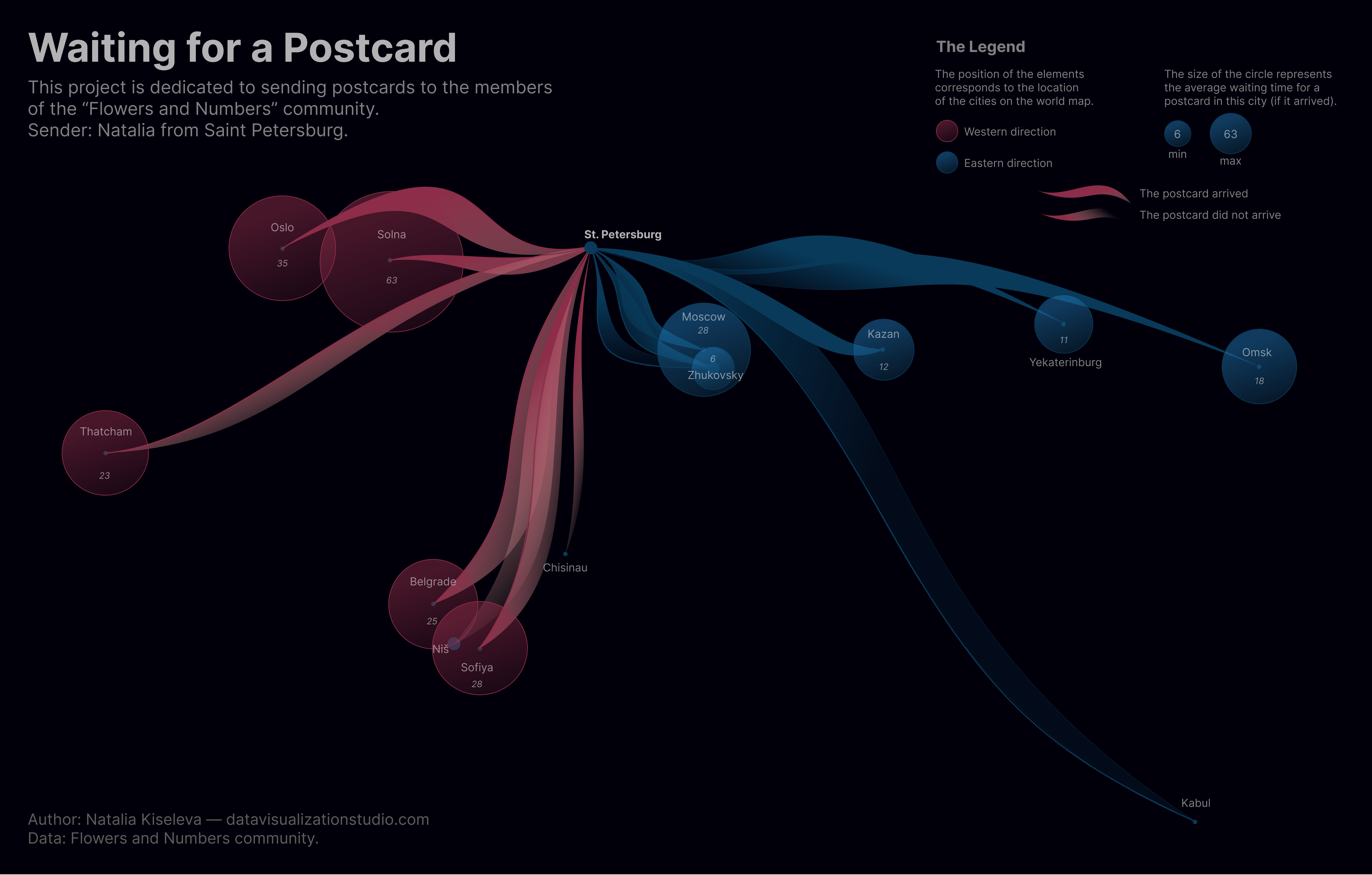
And then, using that data, my colleagues and I decided to create some data art! I finally finished my version — it took a while, I really wrestled with it 😄 But at last, I’m happy with how it turned out! ☺️
There’s also a data art piece by Elena on the postcard project website!
You can see everything and learn more about our little postcards here!
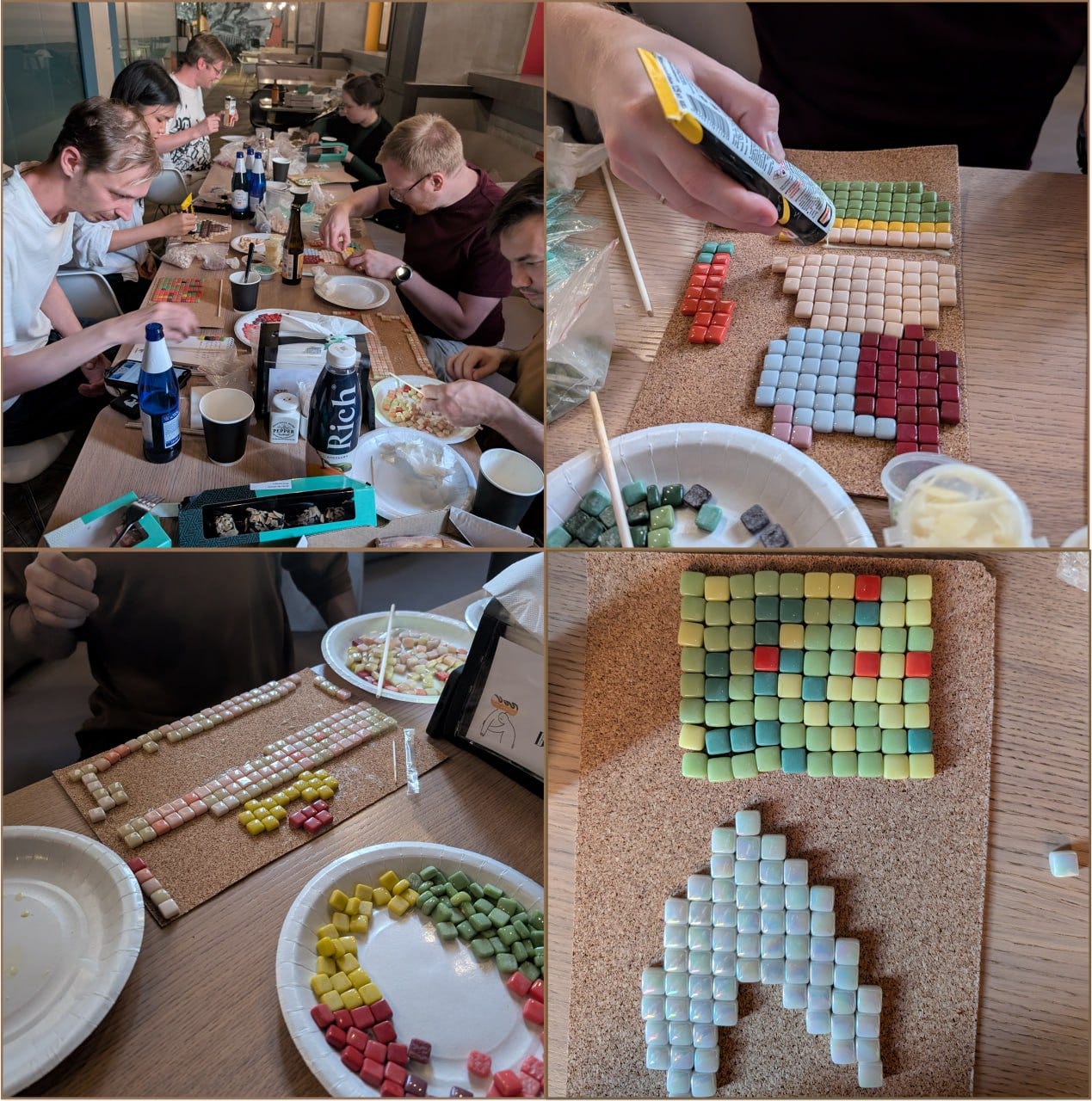
Data Art Teambuilding!
The wonderful Varvara from our community hosted a data art mosaic workshop with her colleagues — and it turned out amazing!
It was a great intro to data art. At this stage, they didn’t focus too much on working with raw data and instead used pre-prepared datasets, but bringing it all into the physical world was still a lot of fun.
And Varvara herself discovered mosaic art in the process — now we’re looking forward to seeing more cool projects from her!
Livestream on Databeads
Another lovely event! We finally got together and hosted a livestream on the topic of data jewelry made with beads! It was a collaboration between the Flowers & Figures community and the Hungarian Databeads community — and it was wonderful!
We chatted for almost two hours! You can watch the video here. The video description includes lots of interesting and useful links!
Travel tp Japan!
Another beautiful piece of data art by Sofya Shandybina!
Sofya chose the visual elements for encoding based on photos from her trip — focusing on the architectural and technical details that most often caught her eye.
She aimed to maintain continuity with her earlier posters about her trip to Japan. This is reflected mainly in the legend design, while the main composition developed its own unique character ⚡️
World Data Art News
An incredibly beautiful piece!
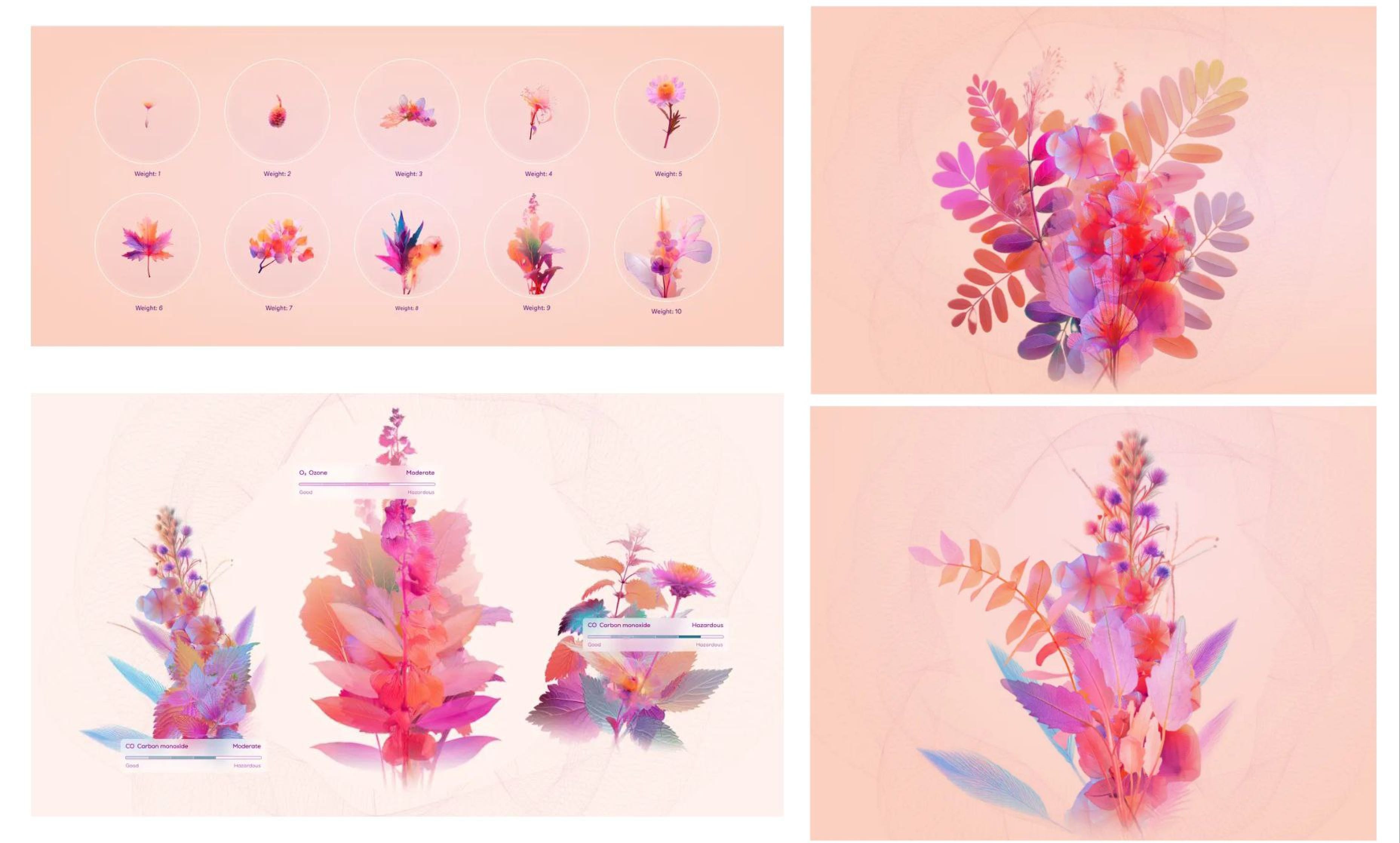
Data on allergy-inducing pollen transformed into generative bouquets — absolutely mesmerizing. You could admire them for hours. And the website and materials are stunningly designed! 😍 Project made by Clever Franke.
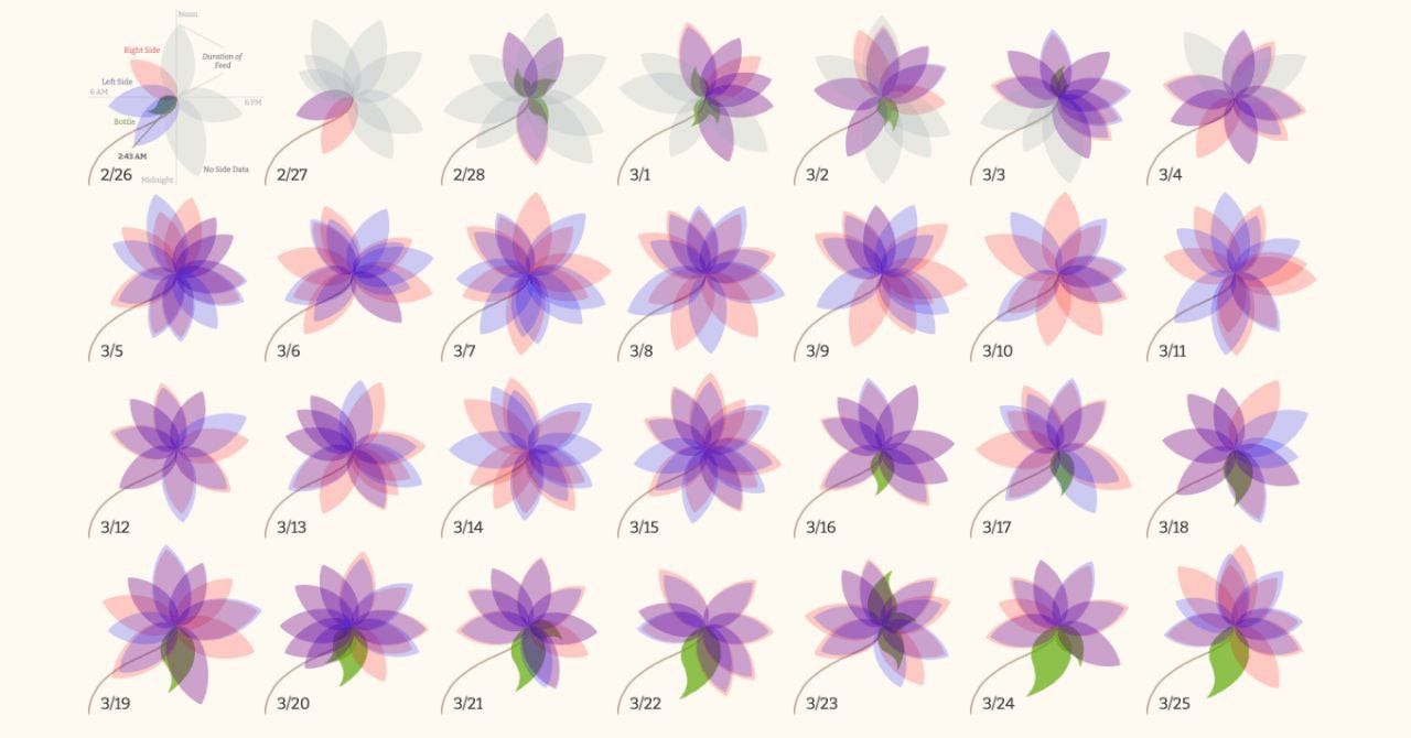
I love projects about parenting!
Here’s a charming piece of data art about feeding — created by the baby’s father, no less 😌👌
And there’s a full article about it by the author, Leonard Pierce, published in the wonderful Nightingale magazine!
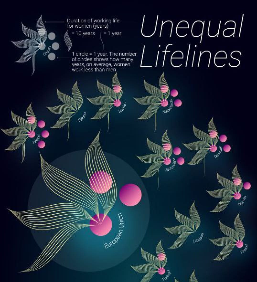
Unequal Life Paths
And here’s a recent project by Edit Gyenge about the length of women’s working lives — and how it compares to men’s — across Europe.
You can find more details in her Substack post:
How storytelling changes what we see
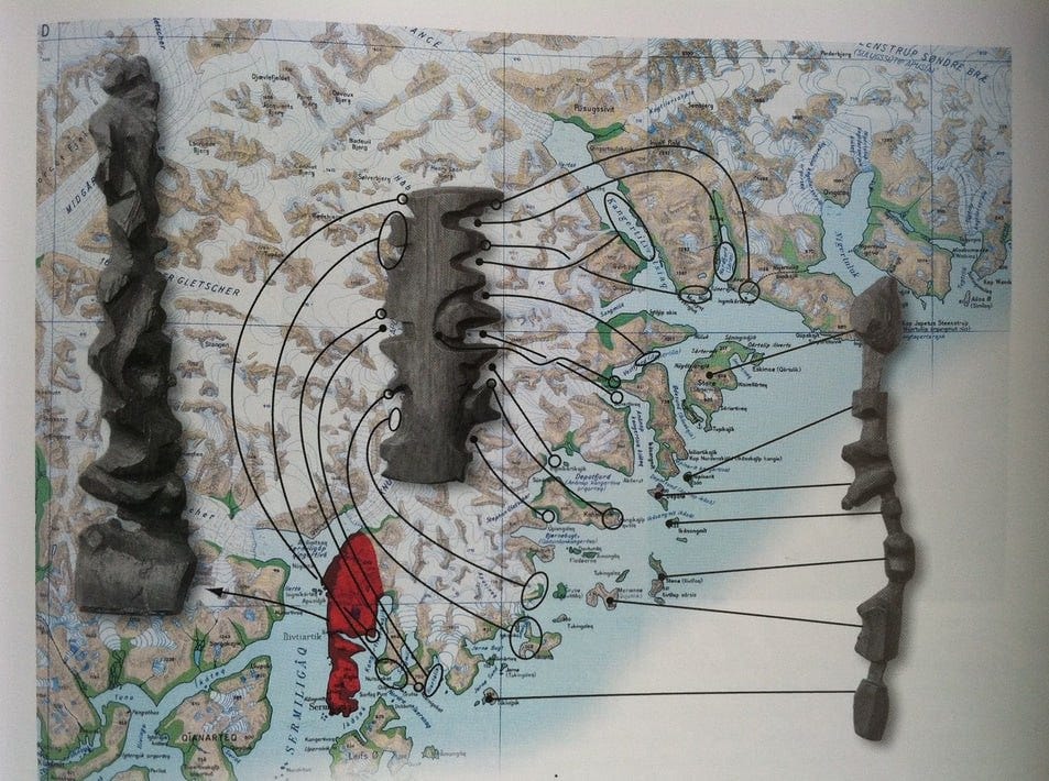
Data Art from a Hundred Years Ago!
Recently, Miniminuteman released a short video about the Ammassalik wooden maps — carved wooden maps made by the Inuit of Greenland’s east coast. These are small wooden tablets without city names or legends, but with the fjords and bays carved in such a way that they can literally be read by touch.
The perfect map: works without electricity, can be read even in fog, and doesn’t mind getting dropped in the water.
Data + Woman: Livestream on Data Art
In October, we hosted a wonderful Data + Woman livestream focused on data art created with fabric and needle!
Julie Brunet shared her projects and talked about this unique direction in data art.
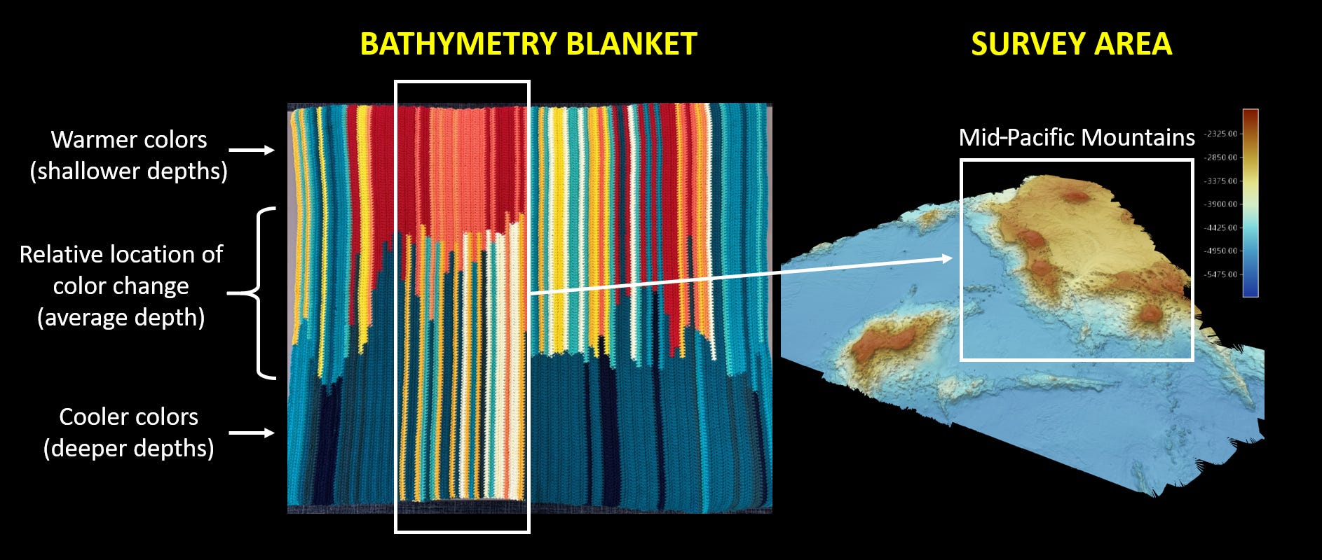
Bathymetric Blanket!
NOAA coordinator Jessie Gwynn knitted a bathymetric chart while spending long evenings aboard a research vessel.
In each row, two colors represent the deepest and shallowest values over six hours of bathymetric mapping. The point where the color changes in the row marks the average depth.
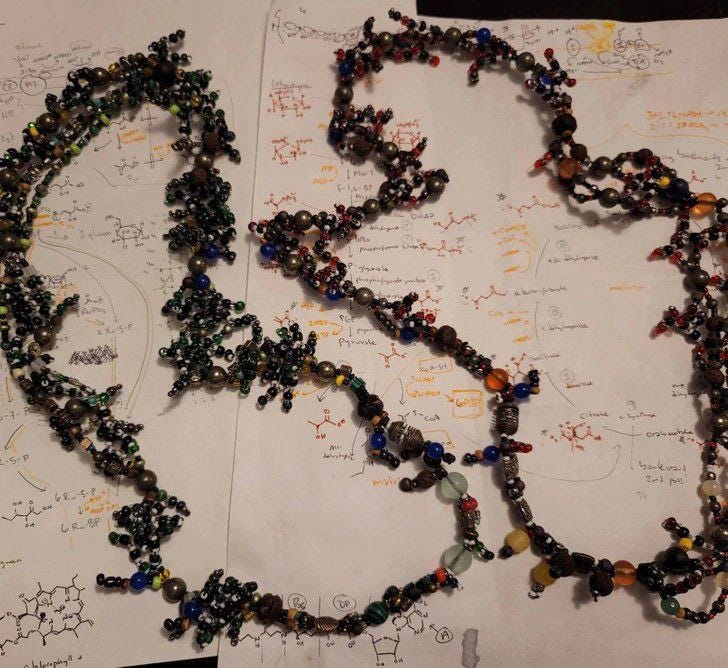
The formulas of cellular respiration and photosynthesis — turned into necklaces!
Look at how formulas can be turned into jewelry!
Ah, it’s a pity the author didn’t submit these pieces to the exhibition in Astana. They look amazing!
And here’s another beautiful one:
“I modeled the structure of insulin as a necklace” — it seems to be from the same author!
It’s a pity there’s no more information about the source.
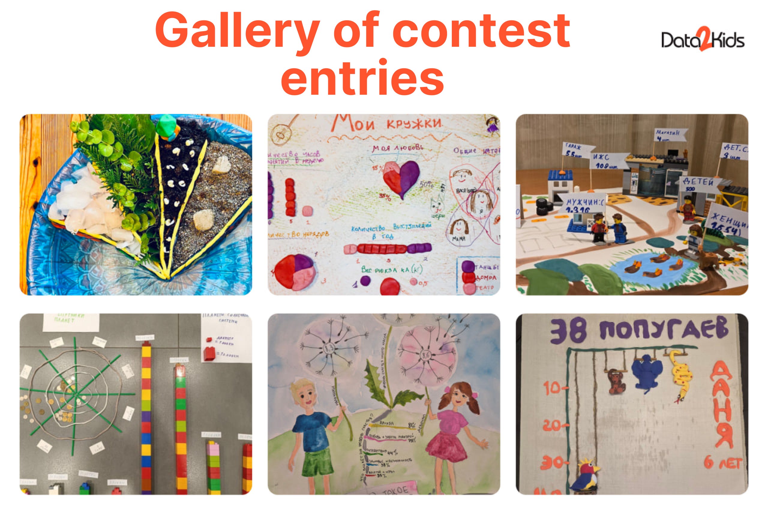
Children’s Data Art!
This project isn’t new, but I really loved it! We just wrapped up our children’s dataviz contest (more on that below!), and during it, I came across this gem.
The wonderful Tiffany Ong creates data projects with kids — and just look at this beauty!
There are so many great details on her website too. It’s amazing to see how creatively families can work with kids and data 🥰
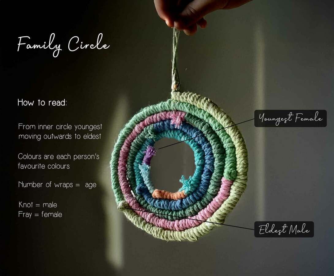
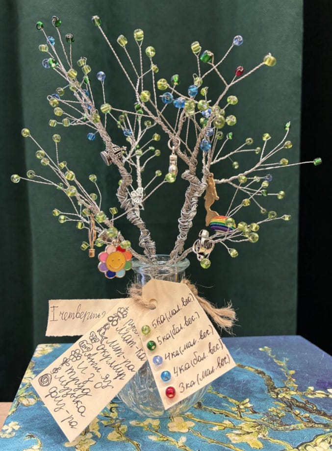
Tree of Knowledge
Here’s another wonderful kids’ project — the winner of the Audience Choice Award in our amazing Data Kids children’s dataviz contest!
A project by Olga Chebykina, 8 years old!
She visualized all her grades from the first term of 2025 using beads: each bead represents one grade, and each branch stands for a school subject. Charms hanging on the branches symbolize the subjects.
So beautiful!!!
My Personal Projects
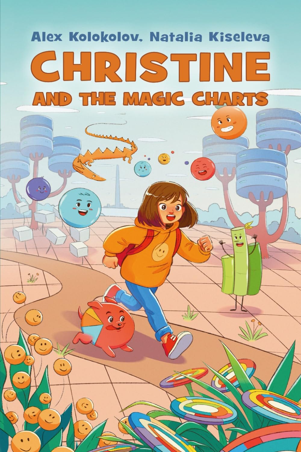
My first children’s book! About dataviz! HOORAY HOORAY!
It’s been a busy autumn, and one exciting result is our new storybook about a girl named Christine who ends up in the Land of Charts! There she meets a puppy named Piechi, a snake called Lainie, and other chart characters, learning the basics of data visualization along the way.
I’m thrilled that the printed book Christine and The Magic Charts is now available on Amazon! I co-wrote it with Alex Kolokolov, and it’s beautifully illustrated by Anastasia Lykova.
At the end, there’s a short character guide and a fun chart chooser — easy for kids, useful even for adults!
Thank you so much for your support!! 🥳
You can get it here! I’ll be happy for your reviews!!!
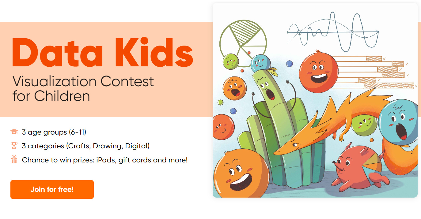
Data Kids! A Data Visualization Contest for Children
I already mentioned it above, but I can’t help sharing more details!
This fall, we held an incredible Data Kids contest in our community! Children had the chance to practice creating visualizations, watch educational livestreams I hosted, and then work on their own projects!
Now we’re planning to take this contest to a global level! Stay tuned for updates!
You can already check out the first version of our website and browse the galleries of practical works here!
Students & Data Art! 🌟
I held data art intensives at two amazing universities in the country! It was so great to see the students’ projects. Of course, they leaned more toward infographics — that’s their area of focus — but still, such beautiful work!
Data Art Talk!
This fall I also traveled to Moscow and gave a talk on data art at a conference! The room was packed — some people were even standing! It was incredibly inspiring!
I spoke about different types of data art, shared my own projects, and talked about the practical applications of data art.
It was so awesome to see how deeply data art resonates with the hearts of data people! More data art, please!
That’s it for today! Thank you for reading!
You can support our community with a donation or treat the author to a coffee at the link down here: